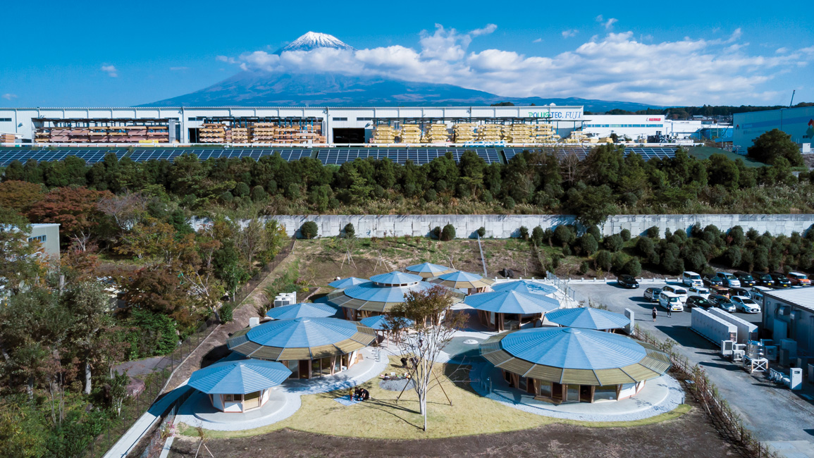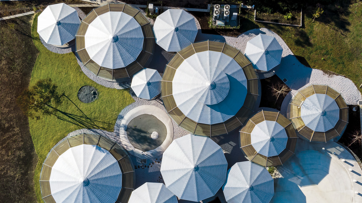
The aerial view of Muku Nursery looks like a collection of soap bubbles slowly rising up in the air, or an arrangement of various-sized sunshades on the beach.
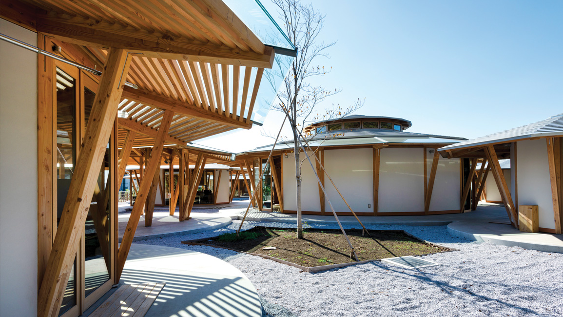
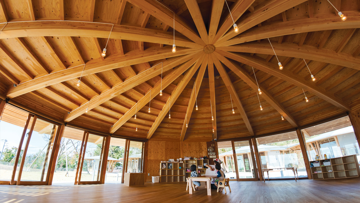
On the ground, the view is a little different, however, when you notice that each “bubble” is actually a circular “room” – an umbrella-covered round space with no walls inside.
This was the vision that architect Takaharu Tezuka had for the school, which is located near the base of Mount Fuji in Japan.
The idea behind the unusual design
“When I started working on the layout for Muku Nursery, I had the image of rice bowls in my mind,” says Tezuka, who, along with his wife Yui Tezuka, founded and runs Tezuka Architects in Tokyo.


“The client also runs a lunchbox company, so the rice-bowl concept made perfect sense to me. Besides, rice is an important part of Japanese cuisine; it’s a source of comfort and nourishment – something that I believe every nursery school should be.
“So I designed each circle to resemble a rice bowl, and if you look at the layout from above, even the umbrella-like tops look like the lids of the bowls that donburi (a Japanese rice-based dish) is typically served in.”
The nursery design is made up of 12 separate structures, bubbles or “rice bowls”, each one dedicated to a specific function such as classrooms and administrative offices.
Combined, they provide a total area of 403.51m2.
According to Tezuka, many architects view circular plans to be disadvantageous compared to conventional modular planning.
For one, round rooms can be difficult to furnish. Second, it can be tricky placing supportive columns in a circular building.
But Tezuka shares a different opinion, “I think circular buildings are actually easier to plan because you are not restricted by geometry.”
To read the rest of the story, purchase and download a digital copy of d+a's Issue 112 (October/November 2019) from Magzter.


 Share
Share
