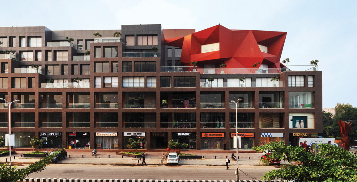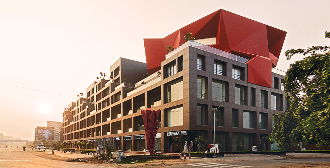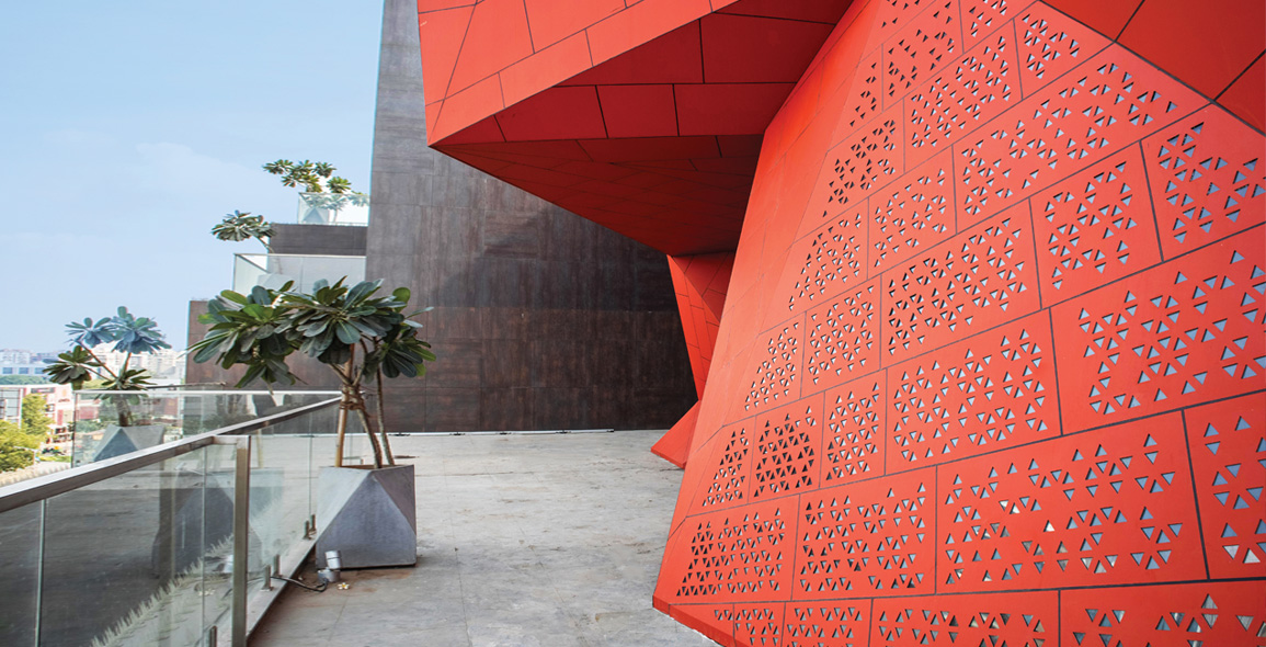
When architect Sanjay Puri was tasked with designing a multi-level, mixed-use building in Ahmedabad in Gujarat, India, he said that his brief was “very specific”.
The client, Dushyant Goswami from the city developer Suvidha Projects, wanted a structure that housed road-facing retail spaces as well as office spaces that measured 400 to 800ft2 each.
The developer also wanted a 5,000ft2 office for itself and requested for the building to be highly visible and suitable for the site’s location and climate.
The resulting construction, Stellar, was completed in 2019 after four years of work.
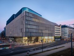
A rectilinear, 110m-long commercial building, it features retail spaces at the lower three levels, and office spaces at the remaining, upper four levels.


All About Visibility
“The site faces out onto an arterial city road and the client wanted the retail spaces to make full use of the extensive road frontage,” says Puri, who led the project.
“In addition, the building was developed for sale, and because retail spaces are generally sold at a much higher price than office spaces, with ground-floor retail spaces being the most expensive, it was important for us to make sure that the retail floors were highly visible.”
To this end, Puri designed the building to accommodate as many retail spaces as possible. He also created direct entry to these spaces from the road.
A long and wide footpath flanks the road-facing north side of the building, ensuring that pedestrians have a clear view of the shop-fronts.
“People in small cities such as this one prefer road-facing shops with high visibility, so we had to get this aspect of the brief right,” Puri says.
Click here to read the rest of the story in the complimentary digital edition of Issue 115: April/May 2020.


 Share
Share
