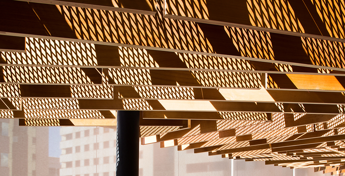
Today’s architects are determined to go beyond design norms to create something special. Bringing the outside in, playing with light and shadow and being flexible with the materials used are some of the unique ways to give life to a lifeless space. The result, like the glorious ceiling of the Norton Restaurant in Brasilia, Brazil, is often a feast for the senses. Located on the rooftop of the Melia Complex, the eatery is designed by BLOCO Arquitetos.
Together with his partners (Daniel Mangabeira and Henrique Coutinho), Matheus Seco reveals that the starting point of any project is be mindful of working within a specific context. Elements like weather, budget limitations, construction process limitations, and program are first analysed. Combined with the cultural background of these natives of Brasilia, their response is to connect to the city and their architectural heritage. “In a case like this we consider our work to be very close to stage design,” shares Seco.
The main aim of the design for the Norton Restaurant is to stress the differences between the floor and the ceiling, and explore the tension between undefined and specific characteristics in a hotel building.
“The tension between the two is always present both in form and colour,” Seco elaborates. “However, we can say that the most important aspect is the difference between the ‘cold’ materials on the floor and all the hotel spaces that you must cross before entering the restaurant and the natural and ‘warm’ look of the natural wood of the ceiling.”
Inversion of Sorts
Seco’s statement makes one aware that in many establishments today, it is common to use wood as floorboards. By using wood on the ceiling, there is an inversion of sorts and begs further explanation.
Obliging, Seco says that all the areas related to the hotel lobby and internal spaces are made of dark colours such as black and grey. The flow of design continues into the Norton Restaurant with the use of uniform lighting design, described as the ‘undefined character’, and connects the dark corridor between the hotel and the restaurant.
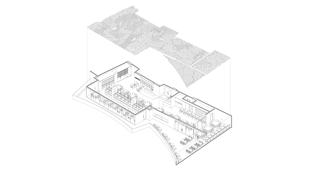
Indeed, the floor plan of the Norton Restaurant is extremely impersonal and standard. Done deliberately, it allows for flexibility so that there are different configurations of layouts. Taking advantage of the irregular geometry to the existing space, the architects are able to create small pockets of space defined by subsequent corners.
What becomes specific in the design is the restaurant’s ceiling. The rationale behind this was best articulated by Rem Koolhaas at the Venice Architecture Biennale 2014. Reportedly, Koolhaas entered a room where the plaster walls were chipped away to reveal ‘a tangle of pipes,’ ‘guts of air conditioning and sprinkler systems’. Describing it as an ‘exploded ceiling’, he argued that, ‘[The ceiling] has become an entire factory of equipment that enables us to exist, a space so deep that it begins to compete with the architecture. It is a domain over which architects have lost all control, a zone surrendered to other professions.’
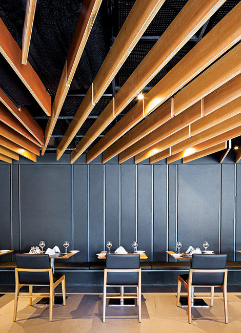
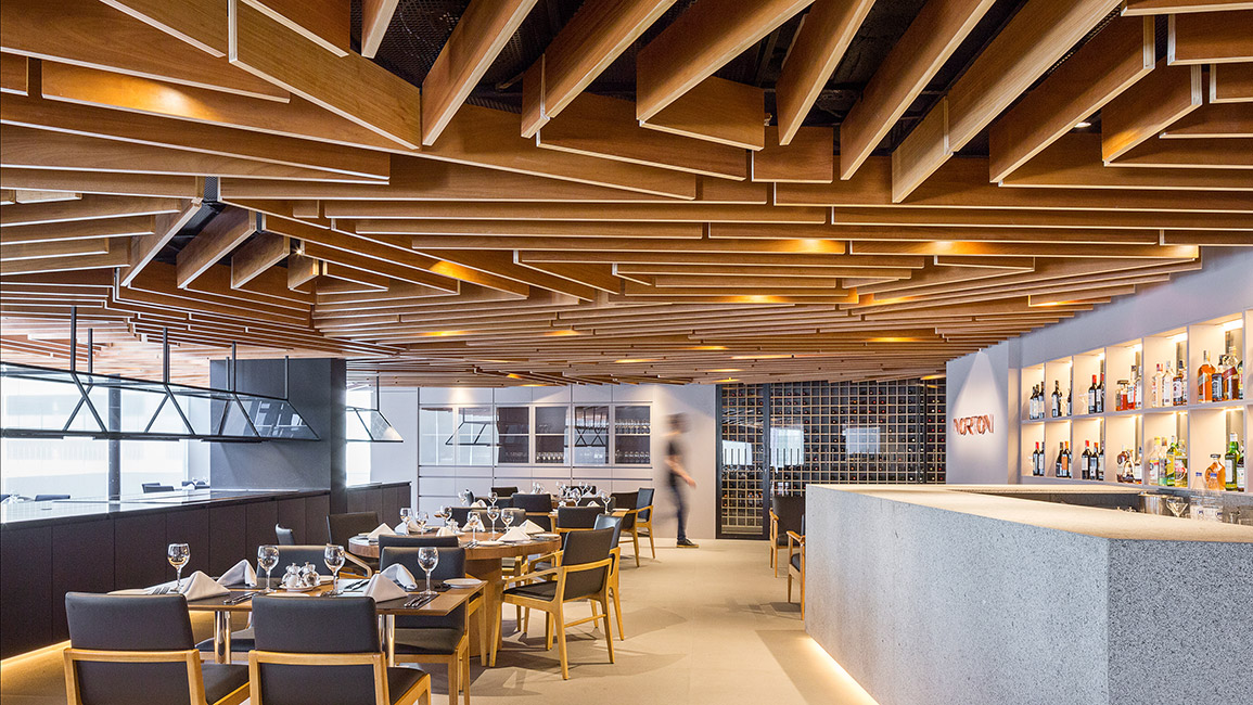 Inside the dining area, the wooden feature looks quirky but inviting at the same time
“Architects have gradually positioned themselves far away of the construction process over the years,” reasons Seco. At the risk of making architecture a superfluous profession, Seco bemoans architects’ lack of knowledge or interest in the construction process and feels it’s a lost opportunity to take part in the construction of a contemporary city.
To reclaim this ‘control of the ceiling’, Seco say, “It is very important for us to get to know more and more about the technical possibilities and requirements that might limit our expression. We believe that all ‘limitations’ related to technical requirements or limited budget be good creative possibilities. The way that architects can deal with these limitations can be our strongest asset.”

Dressing Up
Having decided to redress the imbalance, Seco and his partners let their creative juices flow and created a ceiling that is intense and decorative in equal measure.
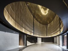
At a glance, the vast ceiling of natural wood stands in stark contrast to its black background and the neutral colours of the floor. Based on an abstraction of an imaginary topography plan, such a plan is a specific way of registering a real topography of an existing place.
By redesigning an imaginary curvaceous map using only straight lines the aim was to disconnect the ceiling completely from a real place. Suspended, the ceiling is made from Tauarí wood slabs, which instantly arouse warmth. Soft to the touch, the wood slabs are fixed on a steel grid, which is clad with perforated steel sheets to allow the air conditioning to flow.
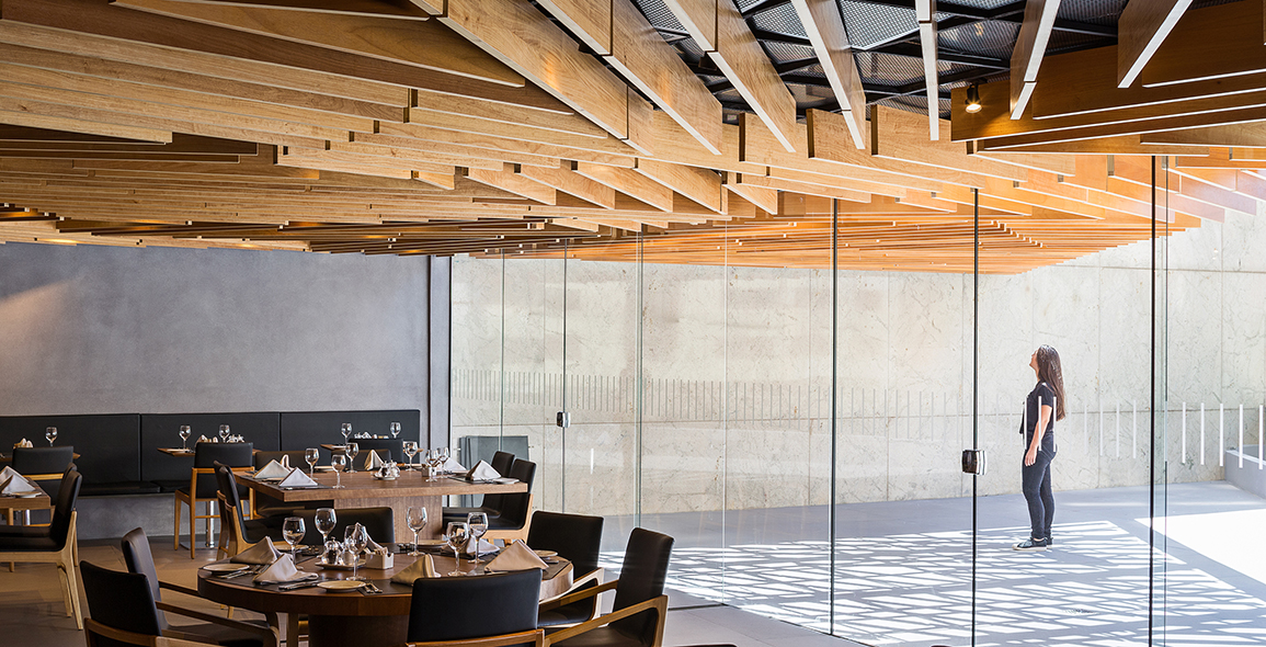
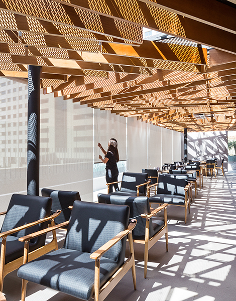
The impact of such a design is best appreciated when you go into that space beyond the Finestri blinds and glass doors. An outdoor verandah, the covered glass roof here allows natural light to filter through the perforated steel sheets. As the sun rises, reaches its zenith and sets, there is an ever-changing interplay between light and shadow, and a multitude of patterns created on the wood slabs and the floor. Working with nature, the space acquires a magical allure, thereby, inducing a sense of being in a state of constant flux.
Evoking intense emotions, there is no doubt that you come away from the Norton Restaurant not merely to whet your appetite. More than architects regaining control of the ceiling, there is a curious sense that this space has become decidedly personal.

A print version of this article was originally published in d+a issue 99


 Share
Share


