Not all office spaces are created equal – some can diminish the employees' morale while others can keep them happy and encourage them to be more energetic and incredibly creative. For giant companies like Google, which require smart, imaginative and in-demand employees, these offices offer a competitive edge when trying to attract the young and intelligent.
There are many ways to make an office boost its employees’ health, happiness and productivity. For starters, some offices feature athletic equipment that helps workers reduce stress and get their happy hormones going. Others offer lounges with pool tables and a well-stocked pantry where workers can relax and feel at home. Nowadays, employers have realised that inspiring office designs does have a direct effect on their employees’ work attitude and can help stir the creative juices.
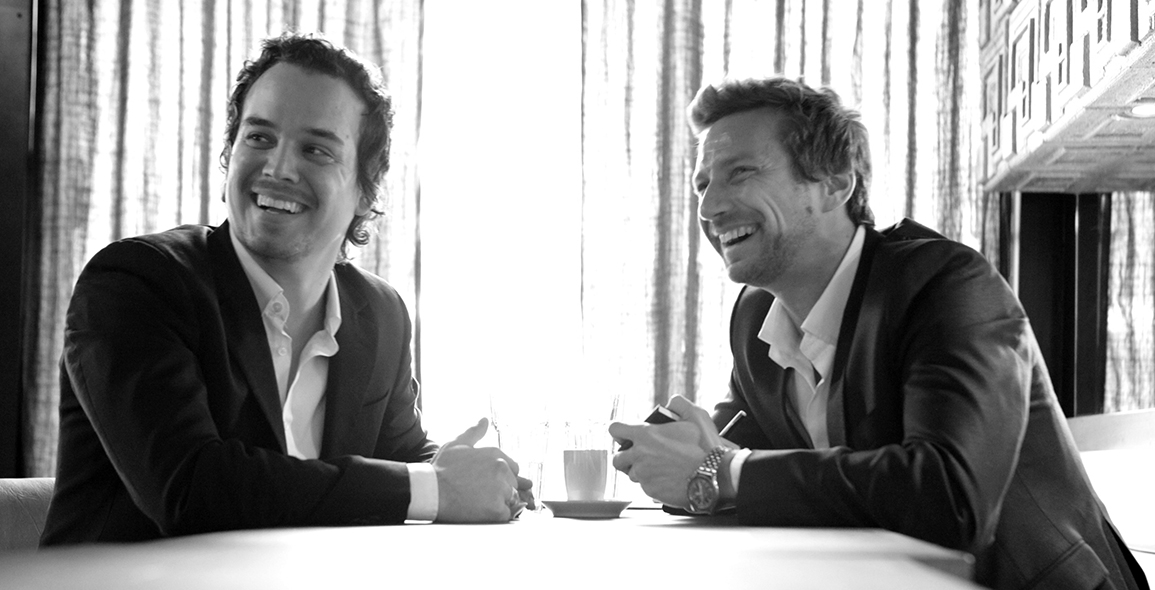
Moment Factory, a Montreal-based multimedia studio has just completed their new office with the help of MU Architecture’s project team. The result is an energised working space that is both inspiring and uplifting. Set in a former industrial area of the Mile-Ex, Moment Factory was once an old, bricked factory and the architects’ challenge was to create a massive “work and live” area for 250 people on two floors totalling an approximate 45,000 square feet.
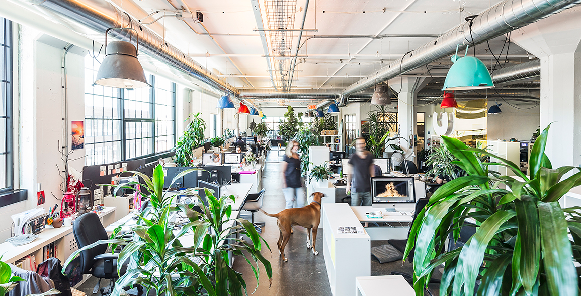
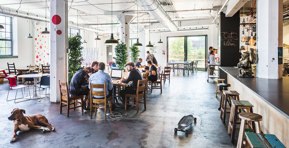
Since it is a company that develops and produces shows for events around the world, the owners of Moment Factory wanted flexibility in the building structure as well as the physical workspaces. The many departments needed to have a fluid connection with each other so that all the occupants are in sync with the growth of the company. Needless to say, the architects certainly satisfied the client’s requirements and much more.
Modern, bright, organic – these three words basically sums up the interior build and design that MU Architecture conjured up for Moment Factory’s office. It definitely fits its work culture too. There’s nothing like cubicles, drop ceilings and carpet tiles to make an office a place people dread coming to. Most modern companies have ditched this outdated style by opting for a more open-concept design, and while that is more aesthetically pleasing, it’s the details that make the difference.
Underground Battle
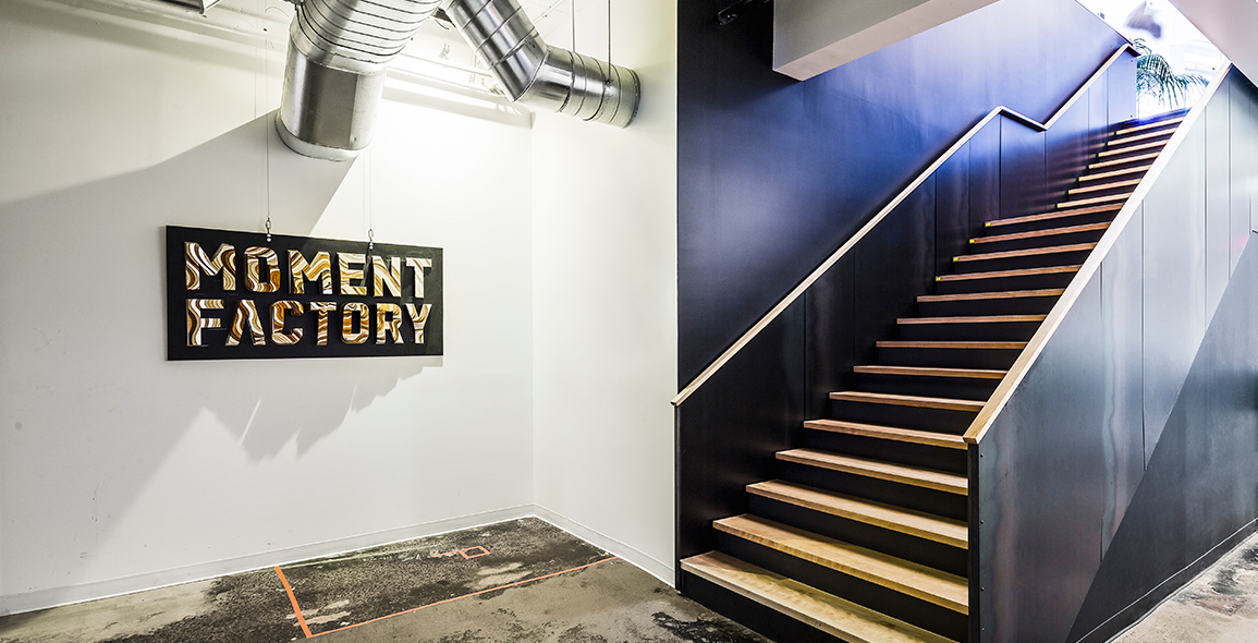
At Moment Factory, visitors are greeted by an ‘underground-feel’, minimalist black steel staircase that, instead of the usual receptionist area, leads them straight into a large, brightly-lit cafeteria. There, the conservative corporate idea immediately disappears in favour of a more youthful and relaxed ambience with the concoction of mismatched chairs, contemporary artworks, brick walls and exposed wiring, casually hooked to the old, concrete beams. Occasionally, pet dogs and skateboards circulate freely among the people in here too.
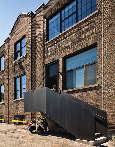

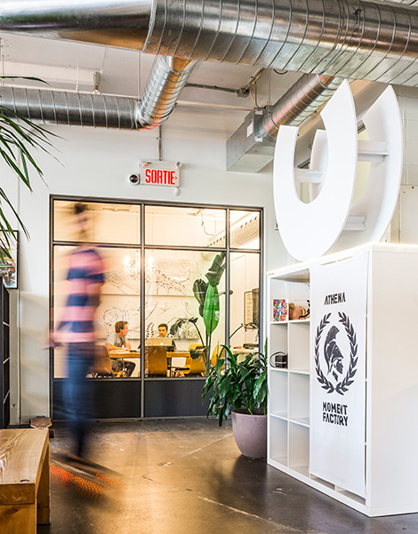

From the cafeteria entrance, employees are able to access into a versatile lobby that caters to a multitude of uses: projections, casual meetings, technical tests, project exhibitions, awards showcase and reception. But the ‘heart’ of Moment Factory has got to be the massive 2,400 sqft studio space set at the centre of the project. To create this studio, the architects decided to cut through the concrete slab between two floors and used super-beams and carbon reinforcements to support the roof. This is the space where working models, life-size devices and projections on the green screen enable the integration of certain projects.
The top floor –where the offices are – is alive and buzzing with employees, models and lots of natural light. Crisp-white workstations that can be moved and reorganised are surrounded by lush plants and coloured panels. Colourful pendant lights inject a playful vibe that contrasts nicely with the masculine concrete floor. Another detail to love is the “Oasis” – a grassy floor space bordered by books, perfect for little chats and discussions or even a catnap in a hammock.
It is quite apparent that the employees here at Moment Factory are encouraged to bring in their own personal touches. Long-time residents and newcomers alike will take pride in making the space their own. By reflecting one’s neighbourhood or culture, employees will feel a sense of community and loyalty.
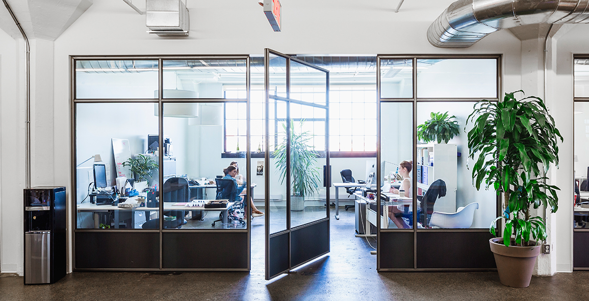
Of course, certain more confidential departments like Human Resources or Finance, conference and technical rooms tend to need a bit of privacy and sound insulation. With that in mind, the architects came up with a system of “blue steel doors” in crude finishes with large glass inserts to maximise work transparency yet maintain a modern, industrial vibe. These doors are also visually aligned with the open-concept. These omnipresent and over-sized openings in the project also allow sunlight to invade the interior volume and bring this notion of loss of scale. The industrial vibe is further emphasised by the visible ventilation ducts and a network of “cable trays” for lighting and cabling, which support the word “Factory” in Moment Factory.
Times have changed and employers need to realise that their workers put in long hours every day, and sometimes the best way to regroup and reboot is by making time for a few moments of fun; create a space where workers can let loose and their hard work appreciated. From there, you can watch the company’s productivity grow. It’s hardly rocket science, people.
A print version of this article was originally published in d+a issue 98.


 Share
Share

