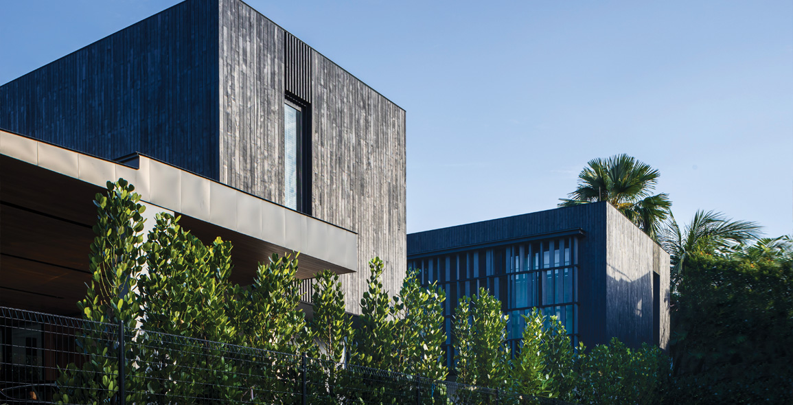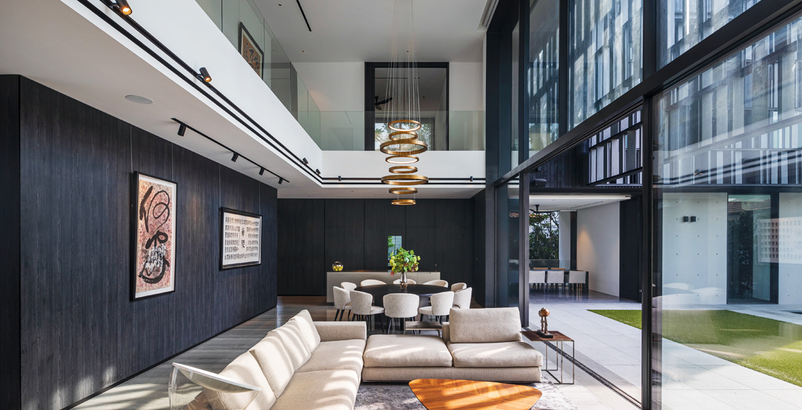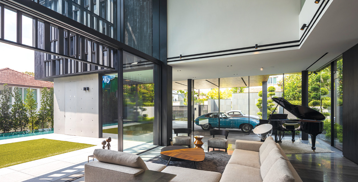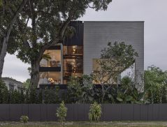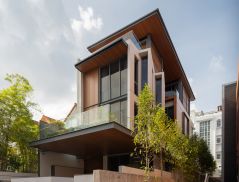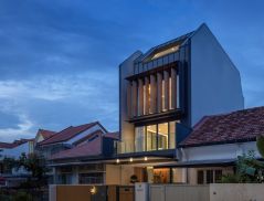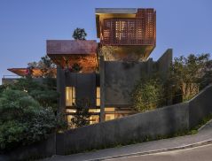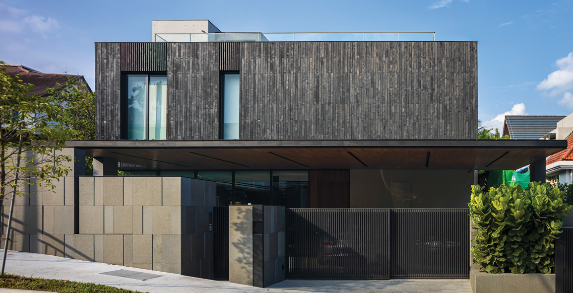
Set on a slope in the undulating Namly neighbourhood in Singapore, Courtyard Variant House is designed by K2LD Architects and born from its topographical context.
Because the site terrain is elevated on the eastern and southern sides, and depressed on the western end, K2LD’s Director Ko Shiou Hee arrived at the solution of orientating the length of the house to face the northwest.
That it would result in the building receiving the heat from the afternoon sun did not deter him.
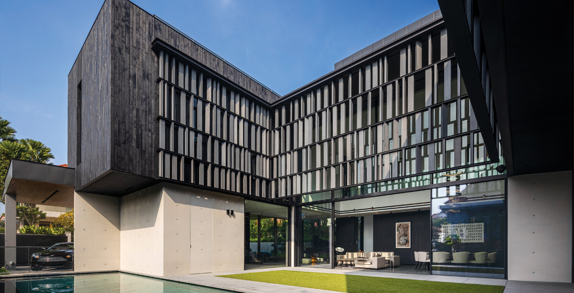
Instead, Ko modelled it in the shape of the letter C, which allowed for a modified version of a courtyard to be inserted between the two wings and double as a focal point.


Light and Shadow
Wrapping the façade of the second floor overlooking the courtyard is a custom-made, porous screen made up of numerous individual panels of wire-brushed, blackened teak fixed in place, but tilted at different angles to give the courtyard a sense of movement.
“The idea of a dynamic-looking screen in order not to block the view to the sky completely, and yet create an irregular pattern when shadows are cast in the house, caught the imagination of the client,” he explains.
“We proceeded to design the courtyard to look different from the outer skin. The screen details also hide the steel bracing that hold the screen lattice together.”
Additionally, it allows the bedrooms that run along it the privacy they require, and partially shields against the afternoon sun.
After many mock-ups, it worked with Daiya Engineering & Construction to manufacture it – something that was necessary since the screen must be held in place independent of support from the ground.
It forms an additional layer between the outdoors and wall of the house, creating an interstitial zone where activities can be held.
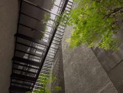
Juxtaposed starkly against it is the fair-faced concrete used on the walls of the ground floor, which Ko deliberately did.
“We wanted to contrast the subtle texture of the wire-brushed teak with a material that is very neutral.
“Fair-faced concrete can be made perfectly without fuss and yet it has the tie-holes purposefully planned to give it an engineering precision that works with our minimalist language.”


To read the rest of the story, purchase and download a digital copy of d+a's Issue 117: August-October 2020 from Magzter.


 Share
Share
