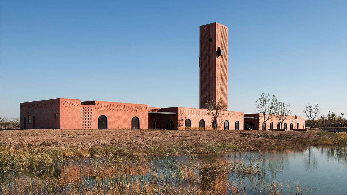
On a wetland reserve near Hengshui City in China’s Hebei Province, Shanghai-based Interval Architects have completed Tower of Bricks – a botanic art centre that references an old brick kiln that once stood on the site.
Abandoned and in bad condition, the former Hoffman kiln had become a place where nearby factories drained their sewage water, and was eventually demolished.
Because wetlands are a convenient water source for plants, local government entity Hengshui Botanic Park converted the area into a green lung. The site of the former kiln was then transformed into an art centre.
“Hengshui was one of the most polluted cities in China. In an effort to combat this problem, the city decided to turn its wetland into a botanic park,” says Oscar Ko, one of the project’s two lead architects.
“The brief called for the design of a supplementary building in the park that would serve as a leisure and gallery space where the public can come to enjoy floral art, plant and pottery exhibits.”

Respectful of the past
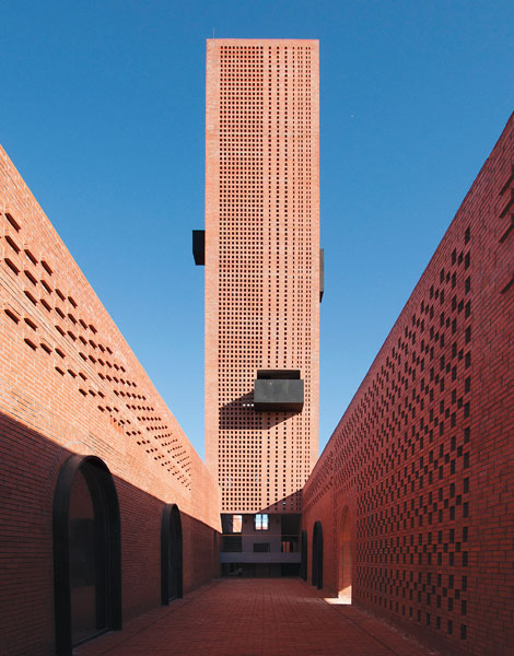
In homage to the old structure, the form of the new building – designed as a vaulted arcade with a chimney in the middle – echoes the spatial configuration of a typical Hoffman kiln, but with interiors that accommodate exhibition and dining spaces.
“We decided that the new architecture should recall the history of the demolished kiln. Our hope is to connect the past and the present in the design of the new building,” says Ko.
Adds Yunduan Gu, the project’s other lead architect, “Our design philosophy is based on context, and we find solutions from our reactions to site conditions, which might include geography, landform, climate, history, human behaviours, and scale. In this project, our solution was a response to the site, as well as the history of the former brick kiln.”
Because the old kiln was constructed with red bricks, the architects chose red bricks as the dominant material for the new-built too. This enabled the structure to maintain a strong link with its history, while conveying contemporary aesthetics and exuding a sense of welcoming warmth.
A variety of stacking patterns was used for the façade to break the dense, monolithic character of the brick walls. This helped to create translucency, enable light and shadow play and open up the building physically and visually.
To read the full story, purchase and download a digital copy of d+a's Issue 110 (June/July 2019) from Magzter.


 Share
Share

