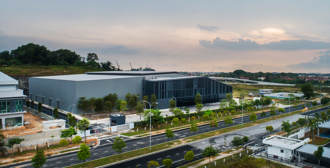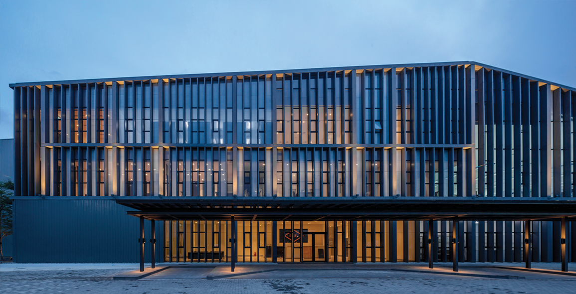
The Janusian tableau of the mega-shed/front office industrial building is a common sight in this part of the world.
Reflecting pervasive, cost-conscious attitudes, the schemes are often a comical shunting of utilitarian design into a modern rear end, almost entirely irreconcilable in language and character.
Malaysian practice Gibert&Tan, who was tasked with designing a headquarters and warehouse, decided that the only way to address these dichotomic qualities was to embrace them, and specifically on their terms.


PRACTICAL, FUNCTIONAL, BALANCED
“ECT is one of Malaysia’s leading independent chemical distributors. What they wanted first was a building that was practical and fairly easy to maintain.
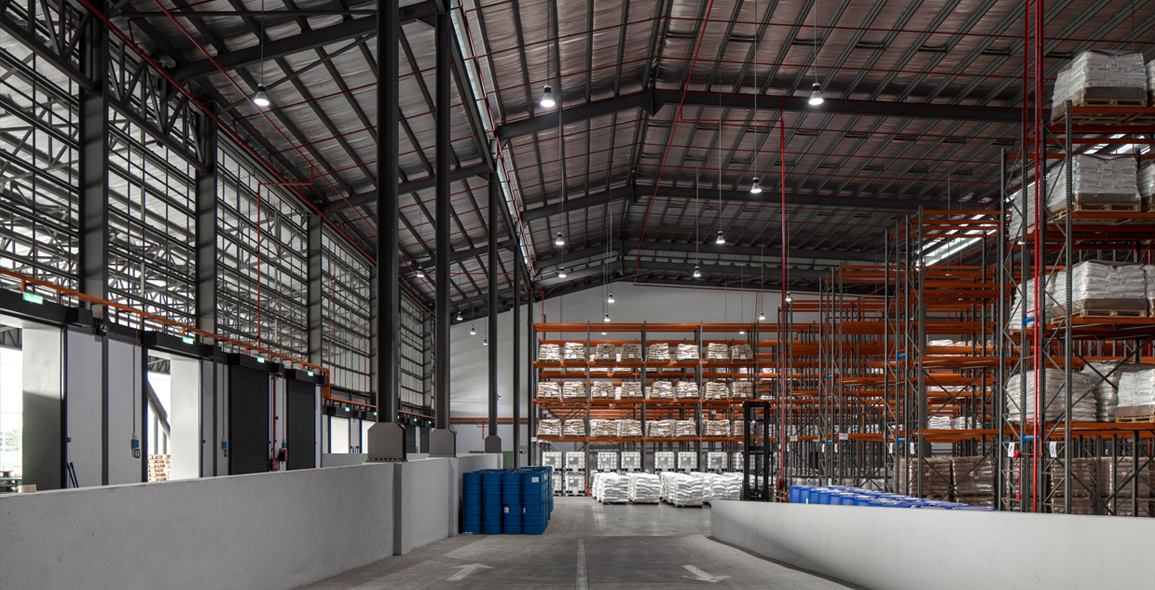
“Functionality was important to the owner, so the design, I would say, is straightforward overall; warehouse at the back, main office out front,” says architect Michael Gibert, a 20-year veteran who, for several years, had been based in Kisho Kurokawa’s office.
“By looking at the orientation of the plot, entry points and logistics, these are what defined the location of the warehouse, delivery bay and how you access the site.”
The front office’s role as a representation of the company invariably creates the schism inherent in this industrial milieu.
Rather than fight it, Gibert opts for acceptance, “When I was looking at that (the office), one of my priorities was not to lie, meaning the design had to remain honest by reflecting the geometry of the warehouse roof.
“It’s a totally different approach, different from the typical boxes you see in this kind of context,” he says, alluding to the office’s unconventional asymmetric silhouette.
“We also used similar materials at both ends to create continuity in the architectural language, a gentle blend between elements.
“For cost and practicality, aluminium cladding was a natural choice, which we specified in various shades of grey, so as to accentuate the building design, and provide a muted sense of balance.”
To read the rest of the story, purchase and download a digital copy of Issue 120: June 2021.

 Share
Share
