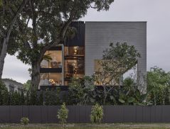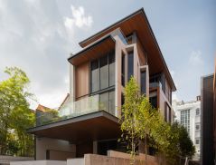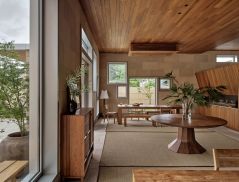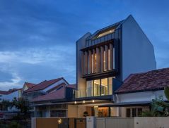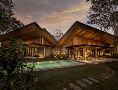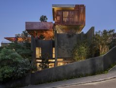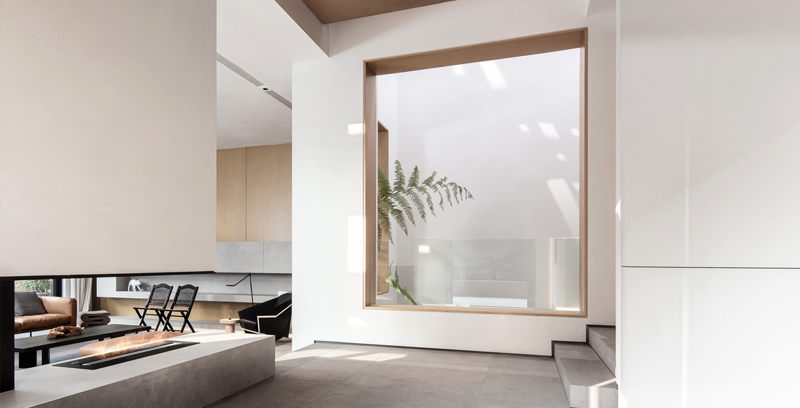
A well-lit space enhances the user’s experience with the architecture.
This is something Xu Liang, founder and creative director of Liang Architecture Studio, understands well.
In response, natural lighting is his top design priority – something which he also introduced in the renovation of this three-storey semi-detached house in Zhejiang, China.
“The client wanted a house filled with ample daylight. It is a luxury to experience the changing of sunlight through the day across the entire space,” Xu says.
“So, in approaching this project, we tried to maximise the amount of natural light in the place.”
The building’s original layout limited the entry of sunlight.
Working around the existing structure, Xu and his team decided to divide the building into two — front and rear blocks — by dismantling the floor slabs along the central axis of the foyer, all the way up to the rooftop.
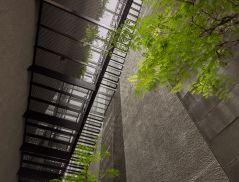
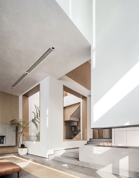
The introduction of this newly-created atrium allows plenty of natural light to stream into all the floors, including the basement.
A perforated aluminium panel was also set under the new glass roof, casting interesting light patterns on the surrounding walls throughout the day.

Interplay of Old and New
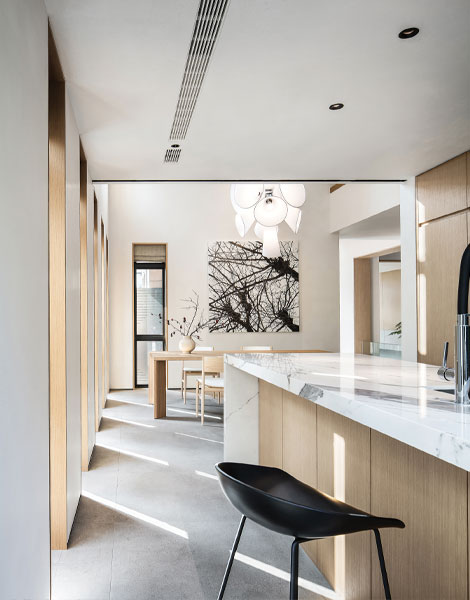
More windows of the same dimensions as the existing ones were added to introduce natural light into the interiors, as well as expand the interaction between the outdoors and indoors.
To further heighten the sense of space, the team also extended out the original facade walls by 1.2m.
Xu recalls, “In the process of doing so, we encountered a ring beam in the structure above the foyer, which I felt would lead to a more holistic design if removed. However, we could neither demolish nor modify it.
“Eventually, I discovered that the presence of the old ring beam across the newly created walls created a striking contrast. And when sunlight shines upon the beam, it emits a unique aura that is captivating and beautiful.”

To read the rest of the story, purchase and download a digital copy of d+a's Issue 117: August-October 2020 from Magzter.


 Share
Share
