 Share
Share
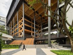
Along Shanghai’s Weihai Lu sits an industrial brick building, surrounded by ‘longtangs’, traditional lane houses. Its aged demeanour belies an exciting new function, as suggested by the words ‘Creatives Welcome’ scribbled in neon lights on the historical Chinese stone arches above the entryway. This is the location of WeWork Weihai Lu, the China flagship of American co-work space and service provider WeWork.
Started in 2010 in New York City, WeWork is known for picking heritage spaces and transforming them into attractive collaborative work environments.
“WeWork loves the charm and characteristics of older buildings. Our design approach is to find ways to bring the building to life, let it be what it is and show off the way it was constructed rather than hiding it behind finishes or with heavy handed interventions,” says Ashley Couch, Senior Associate Director of Interior Design at WeWork.
Their Shanghai branch has an interesting past as a warehouse for the East India Company, artist studios and galleries, and an opium storage facility in the 1930s. In response, the design team took a page from the city’s 1920/1930s belle époque period when fashion and architecture embraced a mix of Eastern and Western influences.
The result is a delightful melody of colours, forms and patterns, creating an engaging setting that well suits the WeWork branding and synergy. It is a collaboration between Shanghai-based architecture and design studio Linehouse, helmed by Briar Hickling and Alex Mok, and WeWork’s in-house design team, with the former focusing on the design of the public areas and the latter on the private offices.
Working Spaces
Past the aforementioned stone gateway, an old laneway washed in pink paint leads to the reception area. This sits in an in-between zone where the original brick structure meets a layer of industrial additions made over the years. Playing with the narrative of a grand hotel “to transport guests and members on an unexpected journey of whimsy, voyeurism and festivity”, the words ‘Ring for Service’ flash behind the wood panelling and concrete counter, against a blue cabinet of curiosities.
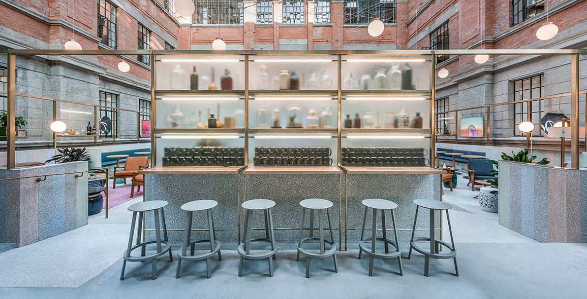
Surrounding it is a bronze metal structure that hangs lights and creates leaners. This bronze frame is used throughout the building as a multipurpose element – casual space divider when fixed with etched glass for the creation of semi-private meeting areas, and holder of lighting fixtures, shelving and artwork. Its materiality injects a dose of opulence, contributing to the narrative.
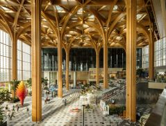
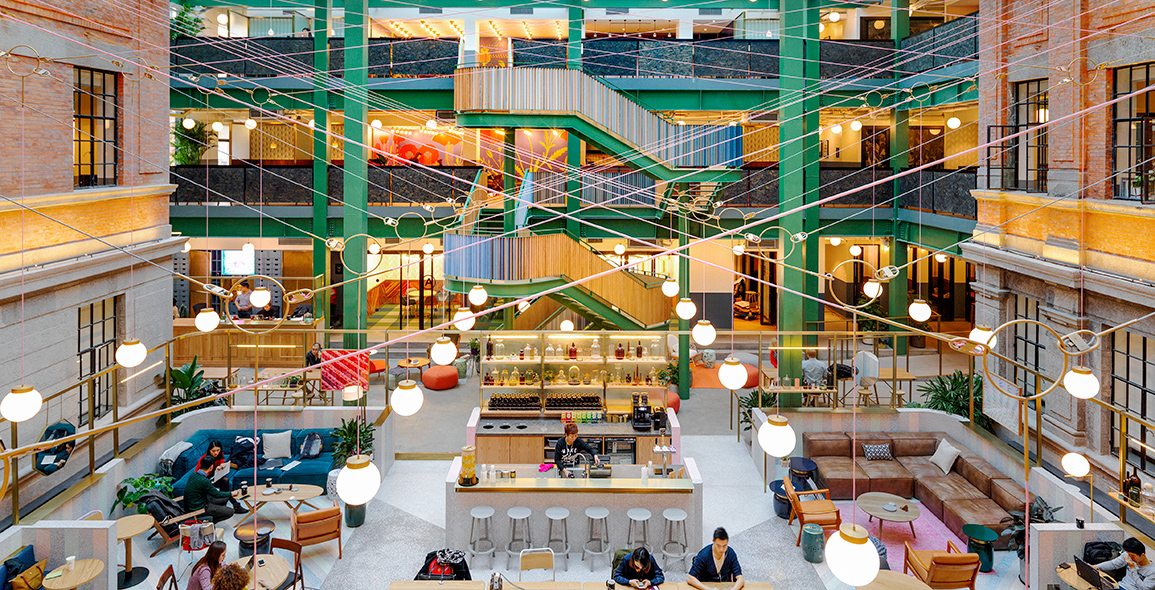
This zesty reception hints at what lies ahead – an equally cheerful mise-en-scène in the central atrium. Covered by a previously added skylight, here is the epicentre of activity that exudes an indoor-outdoor feel as accentuated by potted plants. It is designed for a host of functions – informal meetings, chanced and planned interactivity, event hosting, hot-desking – facilitated by a bar and the relaxed layout of furniture in little islands. An assortment of private and semi-private spaces – phone booths, conversation rooms designed to be as living rooms for informal meetings, larger conference rooms – housed in the surrounding brick building look into this central space.
A curved terrazzo parapet wall, composed of diagonal pastel stripes of varying colours, extends onto the floor as a “hardscape carpet”. Hickling comments, “There was an opportunity to play with the materiality, like brass fixtures, heritage wood panelling, etched glass partitions and terrazzo tiling, to help us define areas of programming without building actual walls or partitions in the central atrium and main areas of activities.”
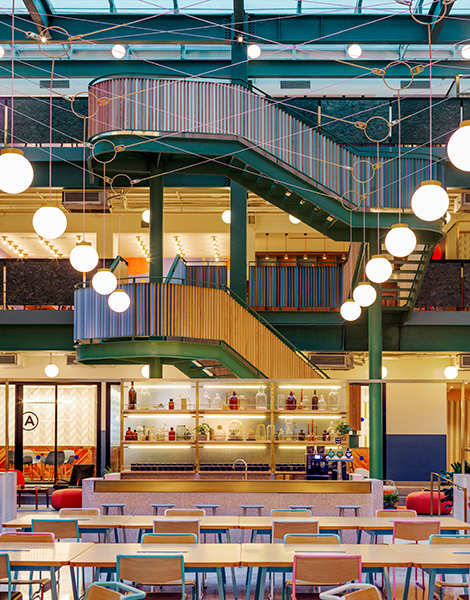
Above the triple-height atrium hangs a custom-designed bronze lighting fixture doubling as a decorative element. It suspends from the brick building so as to minimise any impact on the heritage walls. The light is made from pink and grey cabling, which traverses through the void and is threaded through circular bronze rings that hang custom glass shades. Different perspectives of the light installations, experienced as one moves from level one to level three on the atrium staircase, are designed to lend an air of festivity to the atrium both in the day and at night.
Colour Coded
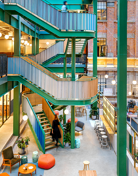
The sculptural new steel staircase in ivy green as its dominant colour is the highlight within the atrium space, providing a multifaceted experience. 16 variations of blue are used to create the gradient effect attests to the amount of details paid to the design.
“This is clad in triangular pieces of oak wood, with one side painted in hues of blue. The colours alternate as you travel up the stairs, creating a gradient of tones, and shifting views from wood to blue. The interweaving form of the stairs inhabits the void of the atrium and as you meander around, up and down the staircase and around the surrounding space, your perspective of the staircase is always changing,” says Hickling.
The designers have left no stone unturned in the design of this project, down to even utilitarian spaces such as bathrooms. Here, custom-printed pink and green tiles with interconnecting lines and shapes clad the walls, ceilings are painted a dusty pink and a mint-green lacquered box contains the cubicles. The use of bronze continues here with custom-designed light fixtures and mirrors above the washbasins that create a parlour-like vanity experience.
WeWork Weihai Lu demonstrates how far the workspace-sharing template has come. This is what the designers have done here, and more; the conversation between the old structure and new elements, and brilliant use of colour, graphics, form and material throughout, present an excellent foil for creativity and inspiration.
A print version of this article was originally published in d+a issue 98.