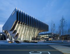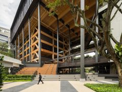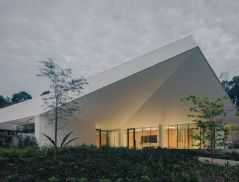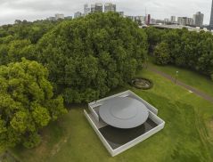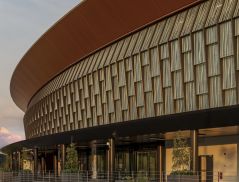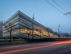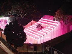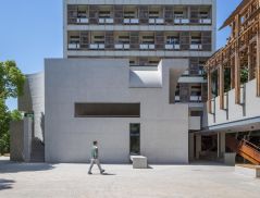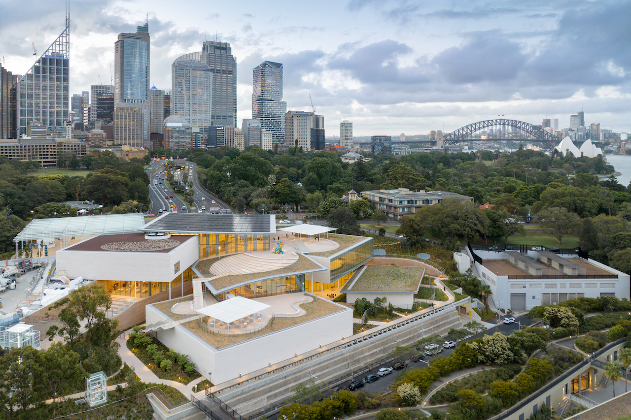
In December 2022, Sydney, Australia, saw a new addition to its cultural offerings with the Sydney Modern Project. Designed by Pritzker Prize-winning Japanese firm SANAA helmed by Kazuyo Sejima and Ryue Nishizawa, the building reviews the museum trope with a spectacular design that makes a fine case study on the relationship between building and place.
“The new expansion is a series of pavilions placed on a terraced site. The experience of seeing art and the building is intertwined with the experience of understanding the site and the Sydney context,” says project architect Asano Yagi.
Specific To Site
The new built forms correspond with the 151-year-old Art Gallery of New South Wales that has an iconic 19th-century neoclassical façade. The fragmentation of the new build relates to the scale of the existing building and brings the landscape closer to the core. “They sit in the landscape plan with the neighbouring Domain – a 34-hectare parkland east of the Central Business District – and Royal Botanic Gardens. The [old and new components] work together and do not dominate one another,” says Yagi.
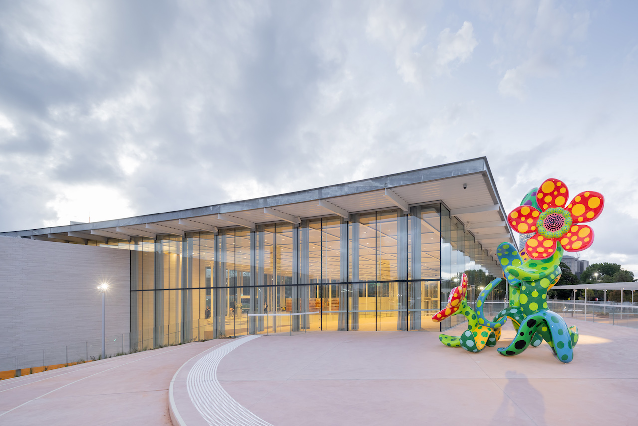 Yayoi Kusama’s ‘Flowers that Bloom in the Cosmos’ 2002 was commissioned for the Sydney Modern Project with funds provided by the Art Gallery of New South Wales Foundation and the Gandel Foundation 2022. Photo by Zan Wimberley
The architecture adds much-needed exhibition space to the existing offerings while respecting and enhancing the use of the surrounding landscape of the Domain. Significant trees were retained and the access to Sydney’s eastern cultural prescient was improved with the transformation of a land bridge built in the late 1990s to connect the Art Gallery to the Botanic Gardens into an art garden and civic gathering space.
The original 9,000 sqm of exhibition space in the building now totals 16,000 sqm, with the new art ‘campus’ comprising eight galleries, research and education spaces, multipurpose spaces, a gallery shop, food and beverage facilities and visitor amenities.
A Multifaceted Experience
The building is experienced as a kind of landform, with ramps, escalators, lifts and staircases taking visitors up and down tall and intimate volumes, and under and above pavilions that overlook other spaces in the kit of parts recalling the insouciance of child’s play; some short and some tall blocks, rammed into one another, slanted this way and that.
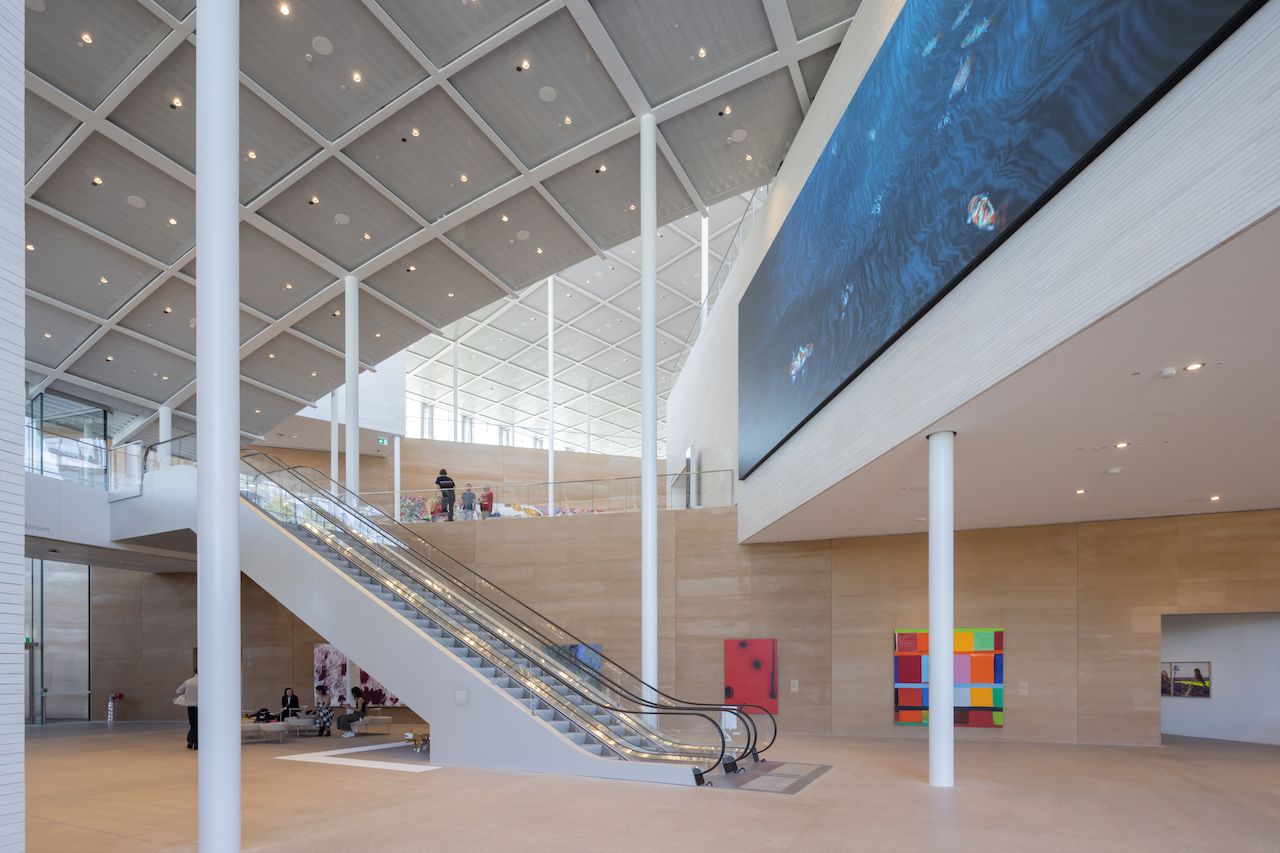 The overlapping arrangement of the pavilions allows for an assortment of spaces such as atriums and terraces.
Indoors segues into the outdoor, and vice versa, with plenty of transparency washing plentiful daylight in between the ‘blocks’, hence creating inviting internal civic spaces for lingering, gathering and pausing. The abundant views outward of significant trees, outdoor art, important sight lines and the site’s undulating contours enable a strong sense of place from the inside. Three central roofs linked as open terraces offer views across the precinct and integrate the gallery experience with nature.
The project rises 20m from the Sydney Harbour to the Art Gallery road where the original building is situated. Three limestone-clad art pavilions trace the topography, gently stepping down towards the water. The structures are made from 250m of rammed earth wall spread over two levels with material sourced from across New South Wales.
Ebb And Flow
A civic plaza (the Welcome Plaza) connects the original building and the new buildings’ Entrance Pavilion. This outdoor area, sheltered by a wavy roof made from 108 sheets of foam-cast glass, is where many activities can spill, and where visitors and school groups can gather and meet. Inspired by the waves at the harbour, the sinuous roof was in-laid with ceramic fritting that informs the shadows based on the changing light quality.
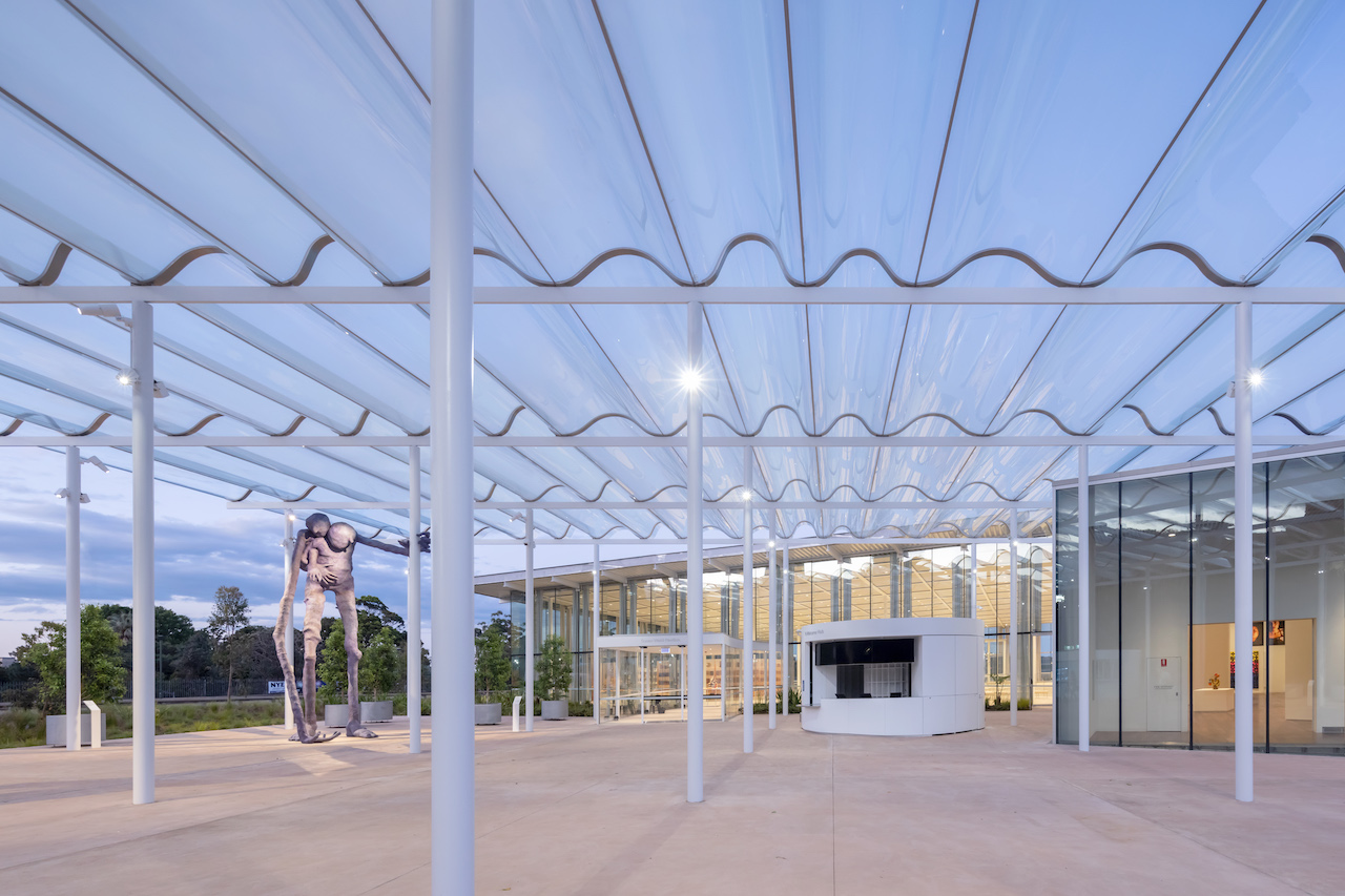 Installation of Francis Upritchard’s ‘Here Comes Everybody’ 2022 in the Entry Plaza, sheltered under an awning of corrugated glass.
Past the Entrance Pavilion is an atrium, which is an important point of distribution to various other spaces. Like the curving lines of the site, the designed pathways are experienced as organic trajectories. The internal art experience starts with the Aboriginal and Torres Strait Islander gallery at the entrance level, where a glazed wall facing the original historic building and a window with a view to the harbour remind visitors of the setting.
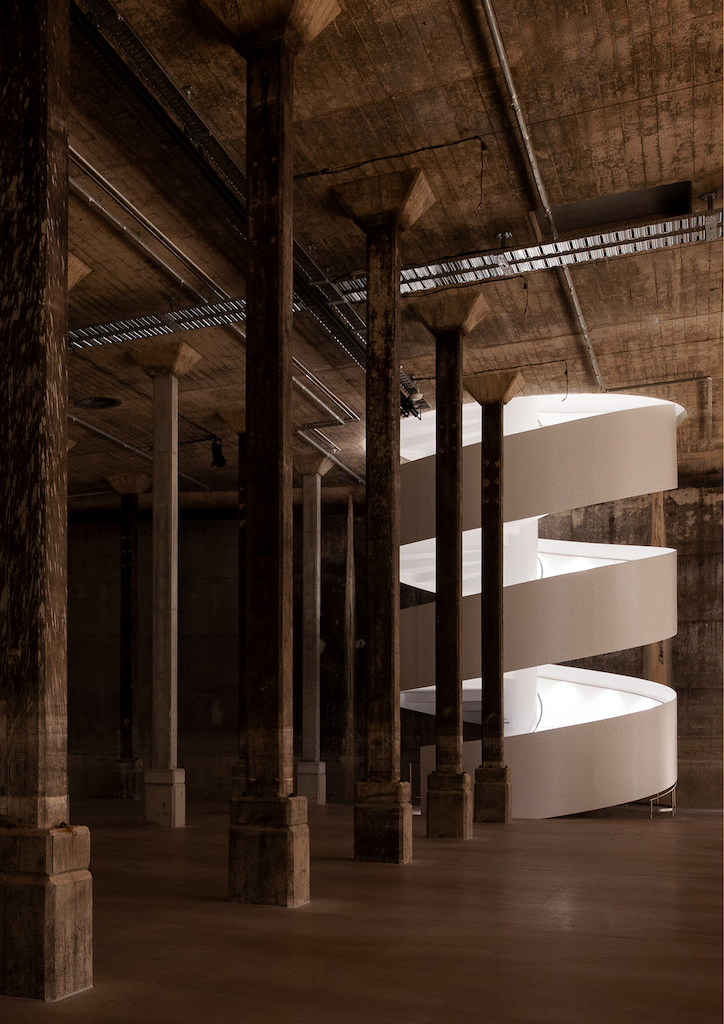
The exhibition spaces unwind down four storeys, with the lowest offering a vivid subterranean encounter in two decommissioned naval fuel bunkers used during the Second World War. Christened The Tank, the 2,200- sqm space with excellent acoustics has been preserved and adapted to house major art commissions and installations among 125 columns.

Green Goals
The project is exciting because it offers manifold ways of viewing art. “With the lighting and environmental consultant, we analysed and discussed strategies for housing art in the various types of spaces,” says Yagi.
The new building is structured in layers. The first layer consists of covered external spaces along the periphery, ideal for exhibiting robust sculptures as they are sheltered from the weather but are not environmentally controlled. The second is a series of buffer spaces with filtered light conditions. The rest of the spaces – the entry pavilion, foyer, loggia at the tall gallery volumes and galleries – are environmentally controlled.
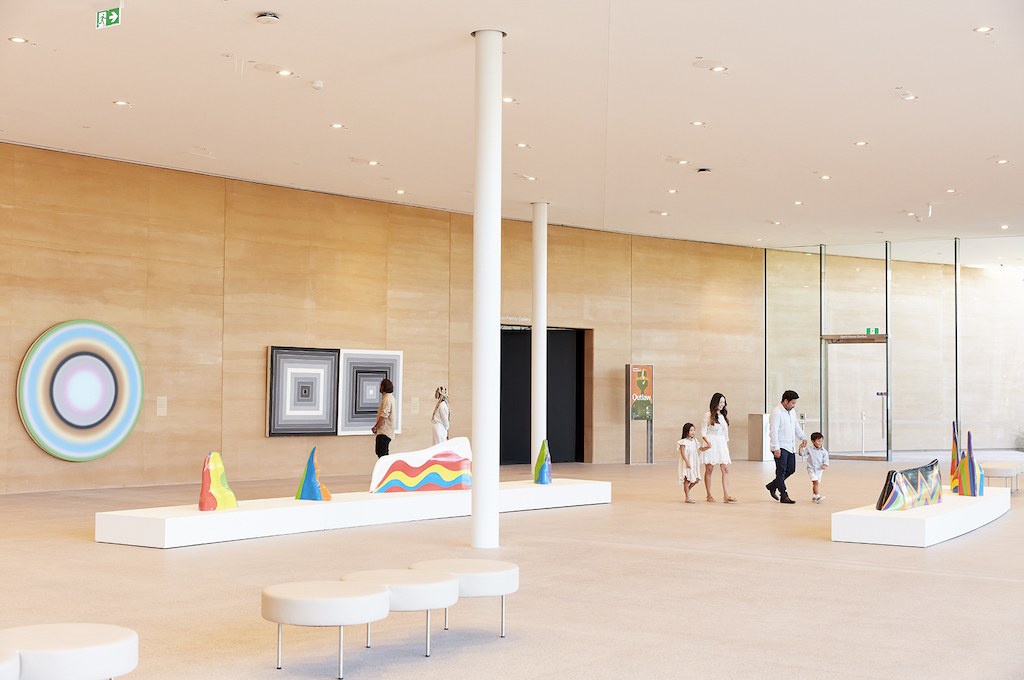 One of the interstitial spaces featuring works by (left to right) Ugo Rondinone, Frank Stellaand Sol LeWitt. Photo by Zan Wimberley
Aside from its idiosyncratic architecture and cultural prowess, the museum also boasts sustainable achievements. It is the first public art museum in Australia to achieve the highest environmental standard for design with the six-star Green Star design rating by the Green Building Council of Australia. Renewable energy powers 100% of the building’s needs and more than 10% of energy needs are generated by solar panels on the Entrance Pavilion roof.
Not forgetting the abundance of green civic spaces, the project will also increase biodiversity by adding 70% more trees on site, and with a significant amount of the landscaping design using endemic ecological planting and reinstating historic species. Details such as this reflect the commitment in creating a museum with longevity.


 Share
Share
