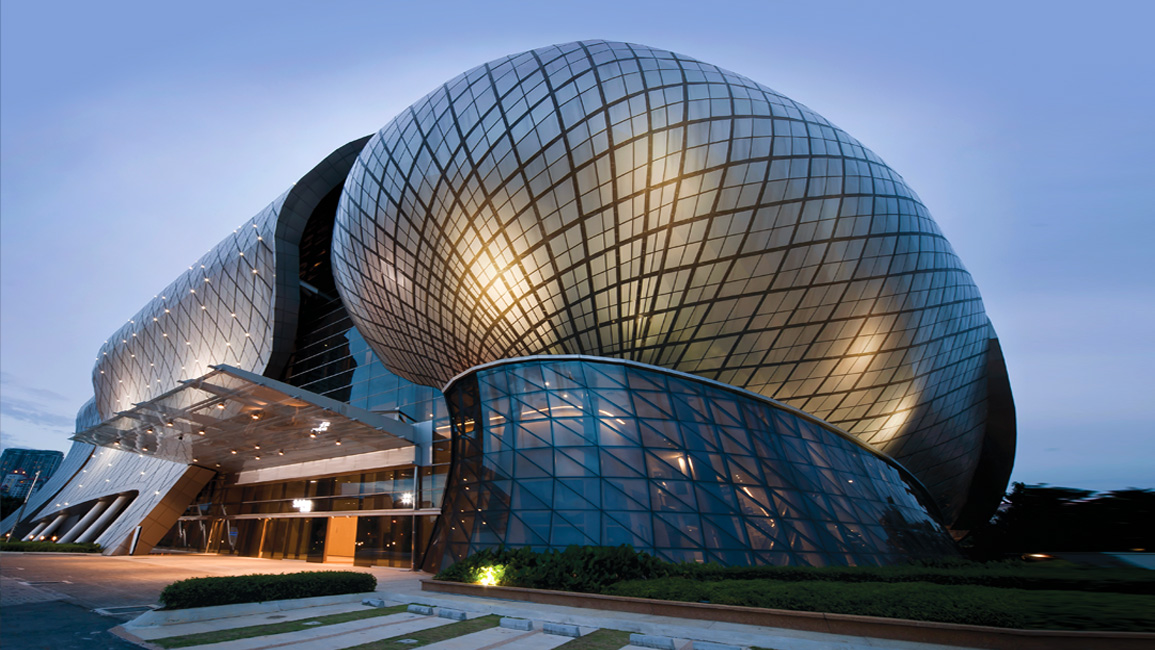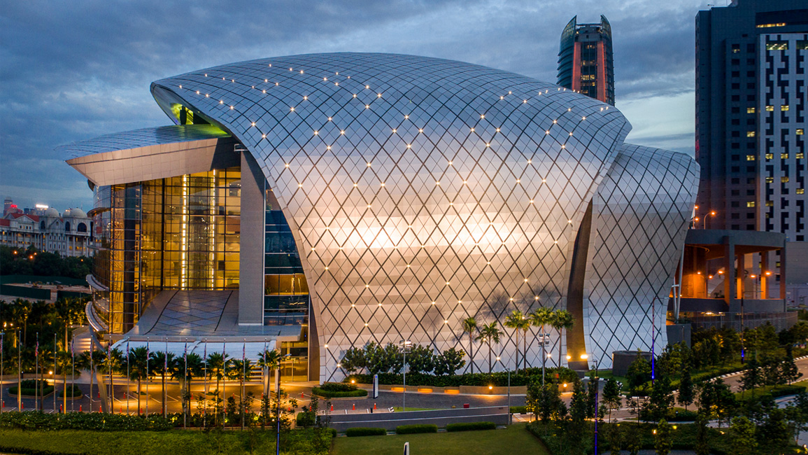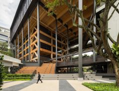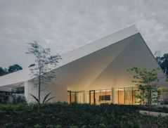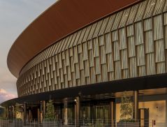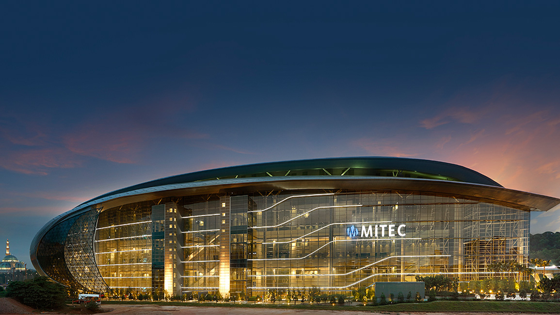
Whether seen at a distance or up close, the Malaysia International Trade and Exhibition Centre or MITEC, warrants marvel.
Consider its proportions – approximately 300m end-to-end, and 64m high at its peak – defined by a sleek curvaceous shape reminiscent of The Arrival’s extra-terrestrial vessels.
It elicits awe upon sight.
Such evocation is not coincidental, and certainly not rooted in science fiction, stemming instead from a novel idea very much grounded in Malaysian terra firma.
Inspiration Of Industry
Sited within a 75-acre in-development masterplan, the multiple-award-winning MITEC and its 141,060m2 of GFA is easily one of the biggest facilities in the region; yet what inspires the building’s enormous mass is, by comparison, exceptionally diminutive.
“We realised rubber was the first crop that actually propelled the industrialisation of our country. Yet rubber itself starts with the seed, and it’s from that that we began to carve the building form,” says Hud Bakar, architect and director of KL-based RSP Architects.
“Bear in mind, when you do long span structures (like MITEC), you need to have a shell. And of course, the rubber seed has a shell, so it was appropriate in that sense.”
That shell, an immense paraboloid of metallic silver surfaces, is the facility’s signature.
Sporting a grid of diamond-shaped, open-jointed aluminium composite panels fixed onto a built-up and waterproofed insulation-metal deck substrate, the double-skin is at once alluring and watertight, and simultaneously sound in acoustic and thermal performance.
The gaps between panels are intentionally made wide for maintenance access, while housing lighting fixtures at grid intersections that accentuate the building geometry and night-time appearance.
Drawing correlation with the rubber seed and its external fruit pod, the shell is split into three, each part rounding towards the ground most noticeably at the building’s south-eastern tip, the bulbous projection of compressed facets transitioning into a curved wall of triangulated glazed panels.
Clearly, from roof apex to façade base, no expense was spared in perfecting the envelope for drama and effect.


To read the rest of the story, purchase and download a digital copy of d+a's Issue 112 (October/November 2019) from Magzter.


 Share
Share
