The Whitney Museum of American Art has come a long way since Gertrude Vanderbilt Whitney opened the museum in New York’s Greenwich Village in 1931, contained within three row houses. Then, the prominent American socialite, art patron and sculptor herself founded the museum to showcase her collection of 20th and 21st century American art after the Museum of Modern Art (MoMA) declined her gift of the collection.
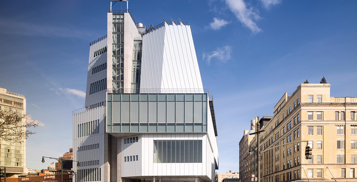
The museum has had a nomadic history. In 1954, it moved to a small structure on 54th street just behind and connected to the MoMA before taking root in a building along Madison Avenue in Manhattan’s Upper East Side from 1966 to 2014 in a building designed by Marcel Breuer and Hamilton P Smith. However, over the years, it suffered increasingly from a lack of space. Its permanent collection comprises more than 21,000 paintings, sculptures, drawings, prints, photographs, films, videos and artefacts, but many were kept in storage. After multiple abandoned designs by different architects, the Whitney finally has a new US$422m home by the Hudson River on Gansevoort Street in the West Village and Manhattan’s Meatpacking District. The striking new structure, opened in May 2015, is designed by Pritzker Prize-winning architect Renzo Piano in collaboration with executive architecture firm Cooper Robertson.

The glass-and-steel structure cannot be more different from its former home. Breuer’s granite building, with its asymmetrically shaped windows and stepped façade, cut an arresting figure but also presented a fortress-like demeanour. Piano’s building is more than sculpture in the urbanscape. Aside from the generous nine stories and 20,500m2 of space comprising approximately 4,600m2 of indoor exhibition space and 1,200m2 of outdoor gallery space, including the fifth storey 1,675m2 Neil Bluhm Family Galleries – New York’s largest column-free museum exhibition space – it also houses an array of support facilities, such as the Laurie M Tisch Education Centre, a multi-use, 170-seat Susan and John Hess family Theatre, the Sondra Gilman Study Centre for works on paper, the flexible Kaufman Gallery for film, video and performance, the Scanlon Conservation Centre, the Frances Mulhall Achilles Library and reading rooms.
But more than square footage, Piano’s design is a building that strives, and succeeds to open up to the public. Says Elisabetta Trezzani, partner at Renzo Piano Building Workshop, ‘It’s not just a museum; it’s really a reaction to the city. One of our main concerns was not to build a building that stands by itself. It needs to be very related and well connected to the city and to the people so that the people would go – for sure in the case of a museum – to see art, but also to hang out. So for the Whitney, one of the main focuses was how we treated the ground floor, the street level. We wanted it to be as transparent as possible, to be an open floor where people can enjoy a small part of their city instead of just being an enclosed public space. So you don’t really see the line between the inside and outside.’
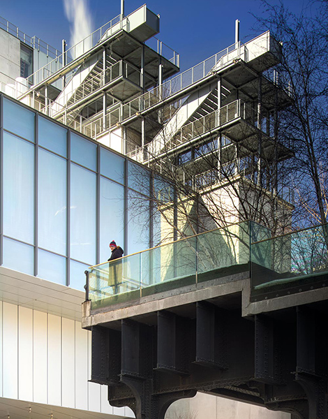
Being well integrated to the site is an important aspect of the design. The new Whitney Museum has the challenge – but also the advantage – of being in a very complex and textured site. On the west end, it fronts the Hudson River, separated by a small road. Facing east just next door is the beginning of one end the High Line park that was created from a disused elevated train track. Surrounding the Museum’s plot is the fine-grain neighbourhood of the Meatpacking district where historical, industrial buildings sit tightly together to give the area its distinct Village feel.
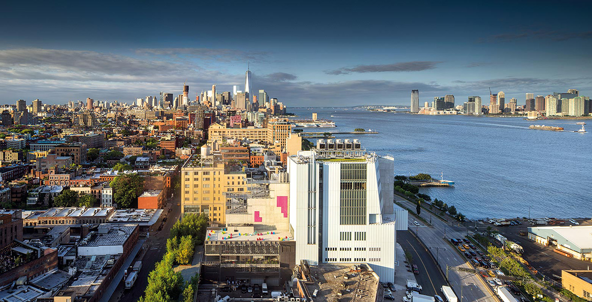
‘From the beginning, we realised that this was a very interesting site. The High Line project was just starting in concept. No one really knew then it would be such a great success but we still realised it was a great [opportunity],’ says Trezzani. ‘The shape of the building, in a way, reacted to the site. One of the main ideas when we started [designing] was to put the bigger mass of the building towards the west side with the view to the river where there was more open space, and then we tried to break down the massing in the direction towards the east near the High Line according to the city [elements] around that area.’
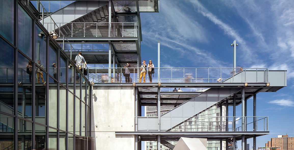
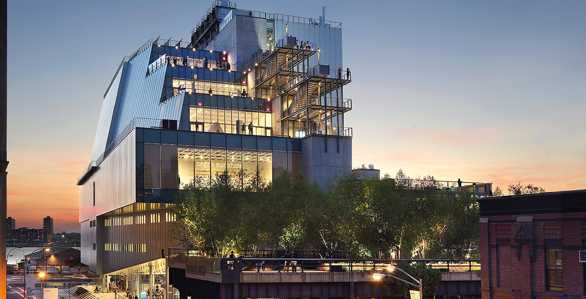
And so on the western front is a façade made up of an asymmetrical kit of parts, with some volumes angled to taper the building gently around the edge as if in polite conversation with its immediate neighbours. On the east elevation, the building reaches out toward the elevated park with a series of cascading terraces cum outdoor galleries, and protruding staircase structures. On the south elevation, the first storey ceiling tapers upwards to face the High Line, sheltering a 600m2 public plaza and the Untitled restaurant. This dramatic architectural gesture welcomes visitors to fill their stomachs pre- or post-museum visit while engaging both street – road level and High Line level – views and pedestrians.
Transparent Matter
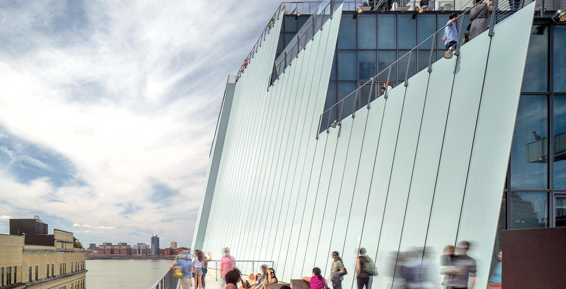
As Trezzani mentions, transparency is a key approach. This means that the museum guest is always reminded of the city and the museum’s presence in the city. Large glass panels invite views both ways, while the outdoor terraces, one of which contains the Studio Café, provide an even more intimate way of contemplating the city from the unique elevated sightlines.
The gritty Chelsea neighbourhood is also the source of inspiration for the Whitney Museum’s understated material palette. Aside from glass, a precast-concrete core and steel elements, such as exposed steel I-beam staircase structures and the 8mm-thick steel façade plates, lend the building an industrial flavour. These are articulated in slightly different ways that prevent the overall structure from having a bland, homogeneous look and that also add definition and a sense of scale to the building’s skin. The interiors are characterised by blue stone in the lobby and main staircase, and reclaimed pinewood for the floors of the galleries and support spaces.
Trezzani highlights that another unique aspect of the building’s design is in the way the programs are distributed. She explains, ‘One important thing the Whitney did was, instead of putting all the facilities like the conservation lab [hidden away] like many other museums, these are in the spaces above with the big windows and on the same level as the galleries, so there is a lot of connection and relation between these two types of spaces. That is something I find very interesting.’
On plan, this reads loosely as the vertical circulation elements, such as the four large elevators and central staircase as well as building services, running down the middle of the building, with the galleries to the south wing and the support facilities to the north. Guests ambling through the museum are privy to the workings of the museum, making this an educational experience.
Additionally, the elevators are actually a moving permanent artwork ‘Six in Four’ by Richard Artschwager (1923-2013), to engage the visitor even in transit. It was artist’s last major work created before his death and fits into the industrial foil with shells of plastic laminate, glass and etched stainless steel. Visitors entering each elevator are exposed to a surprising encounter of standing under a table or being on a rug in front of a mirror.
A print version of this article was originally published in d+a issue 89.


 Share
Share
