Two hundred years ago in 1819, Sir Stamford Raffles arrived in Singapore, resulting in a turning point in the island’s fortunes. In commemoration of this, we saw a slew of activities held throughout 2019, each exploring a different aspect of not only the past two centuries, but also the 500 years before 1819.
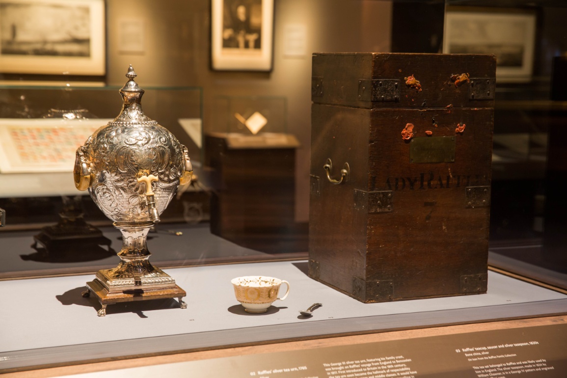
One such example is the exhibition An Old New World: From the East Indies to the Founding of Singapore, 1600s–1819, presented by the National Museum of Singapore (NMS) and on till 29 March 2020. Split into six zones, it features over 220 artefacts. They include loans from the families of Sir Stamford Raffles and William Farquhar, and highlights from our National Collection.
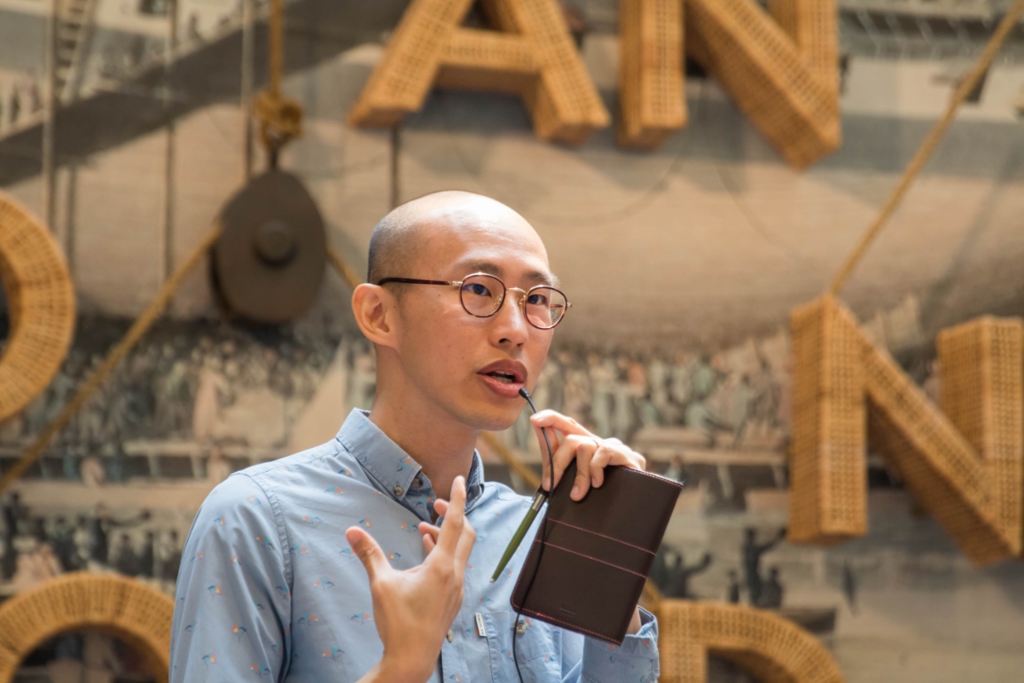
Beyond understanding its genesis, we also wanted to find out how the principles of exhibition design impacted this show. To this end, we sat down with NMS’ curatorial lead Daniel Tham and GSM Project’s senior graphic designer Melissa Chan for a chat.


Defining the scope
Daniel: When we were approaching the Bicentennial, we looked at what we have done so far and where the gap was. Our Singapore History Gallery covers quite a bit on the arrival of Raffles and Farquhar in 1819 and the 200 years after. We have also covered 14th century Singapore. Therefore, it was decided we should examine the 200 years before 1819, which coincides with the founding of the English and Dutch East India Companies to take advantage of the spice trade in our part of the world. We also took a broader geographical scope, looking at Singapore in the context of the region.
We decided on the title An Old New World because it reflects what we wanted to achieve with the exhibition by presenting different perspectives. From the European perspective, it was that this part of the world was a kind of new world to be discovered. From the local perspective, this was actually an old world that had been thriving for much longer and did not need to be discovered.
Principles of exhibition design
Melissa: It is always about content, context and how we translate the narrative or what the client wants to convey to the visitors in a meaningful and accessible manner. A key priority is to present the artefacts authentically, protect their integrity and attribute importance to them. This means to clearly distinguish between the artefacts and props that make up the scenography. As we design the layout, graphics, art direction and lighting, we constantly negotiate how much space to reserve for the curatorial voice and visitor interaction. It is important to balance them to ensure neither outshines the other.
In the case of An Old New World, we tried to do things quite differently too. We adopted a thematic approach of a sea expedition and exploration, where visitors can actively engage and participate in retrieving information
Daniel: As a curator, we conceptualise the exhibition, do the research and then source and select the artefacts. Museums tell stories primarily through historical objects. We then work very, very closely with exhibition designer, through ongoing conversations, to create the experience for the visitor. We are quite mindful that an exhibition is not a term paper, that is why we try to layer the information.
For example, with An Old New World, we had the exhibition itself. But we also have the exhibition catalogue, where I got to write a bit more. We also had a conference, Encounters & Connected Histories: Prelude to 1819, in conjunction with the exhibition, where dialogue and debate took place that would have been hard to capture in the exhibition.
Engaging the audience
Melissa: As a national museum, the exhibitions are viewed by a very diverse audience from locals, such as students and academics, to tourists. They are always the main focus in everything we do. With An Old New World, we knew from the start that we wanted to capture the concept of the tension between old and new, and that interconnectedness, which is how we ended up using elements from shipping – specifically lines and ropes. Among the artefacts are also a lot of maps and their line motifs contributed to the basic design approach.
Creative styles of presentation
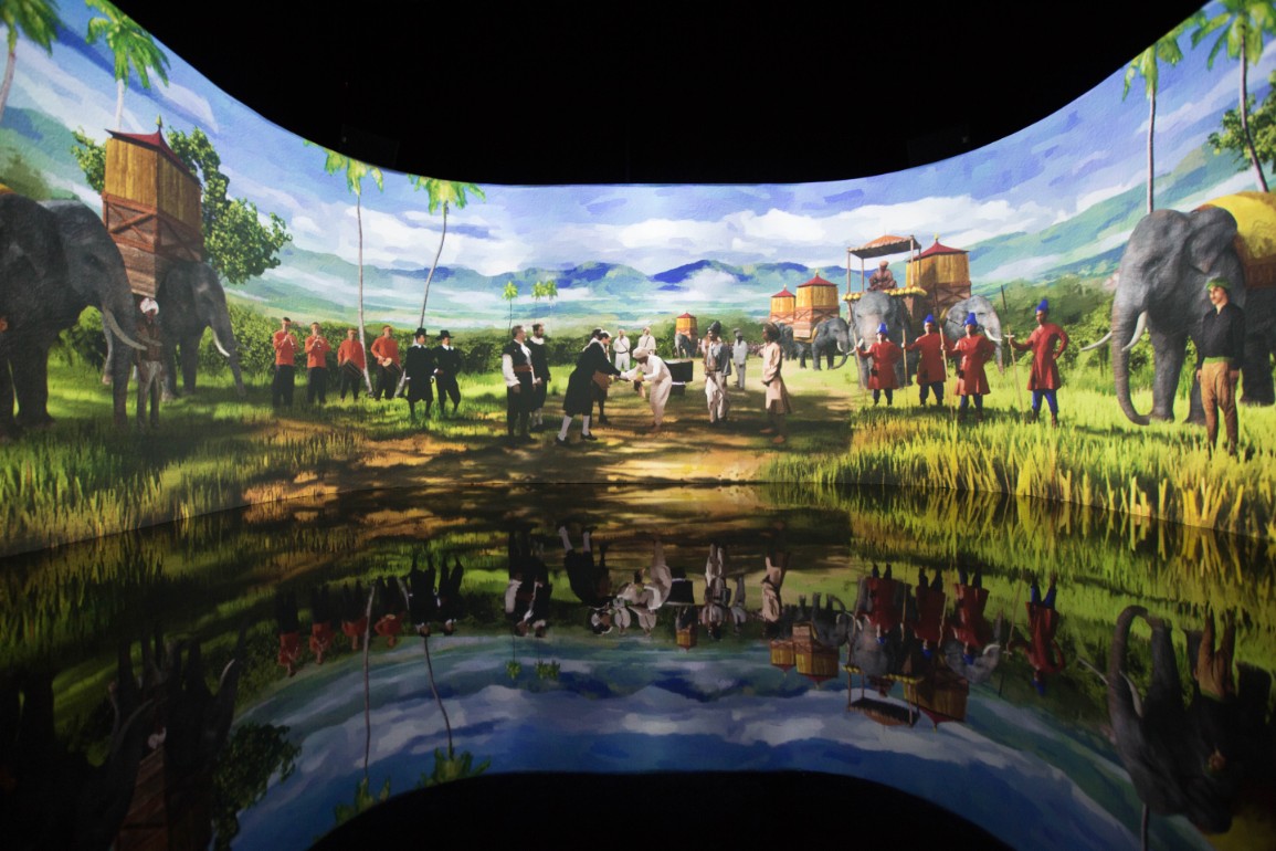
Melissa: From the perspective of design, we always consider ways to present the information differently. The opening sequence of An Old New World is a good example. This is an animated, multimedia show, Meeting of the Worlds, dramatising the arrival of the first fleet of the English and Dutch East India Companies in Aceh in the 17th century. It plays out in a 7.2m wide room, on a 20m-long, curved screen that wraps around three-quarters of it.
Daniel: Meeting of the Worlds came out of a discussion we had with an academic panel we consulted with while conceptualising the exhibition, who asked how we were planning to depict the local music, dance and traditions of that period. In addition to re-enacting the arrival of the first fleet, it sets the tone that our part of the world was not a backwater. We wanted to counter that stereotype that the region was a primitive place where Europeans came, planted a flag and civilised us.
This was based off an account that mentioned, from the English perspective, how when they arrived, there were already 16 to 18 ships already in the harbour. Bustling trade was taking place and they were entering into that trade network, not creating one. We had no objects related to that first meeting, nothing has survived for us to use, so producing a show made sense.
Chronological vs. thematic
Melissa: This is something we have to decide for every project. In the case of An Old New World, a thematic presentation makes a lot more sense, especially since we are trying to provoke the younger generation to think about history. In general, a chronological approach has a more top-down feel to it.
Daniel: We knew we wanted it thematic, but some things still have to be experienced in chronology. I think there is some expectation by visitors going through a historical exhibition to understand what happened, how it started and how it ended. We try to balance that. It is only in the final zone that the information is more chronological, where we look at the years leading up to 1819.
200 years over six zones
1. Mapping our World
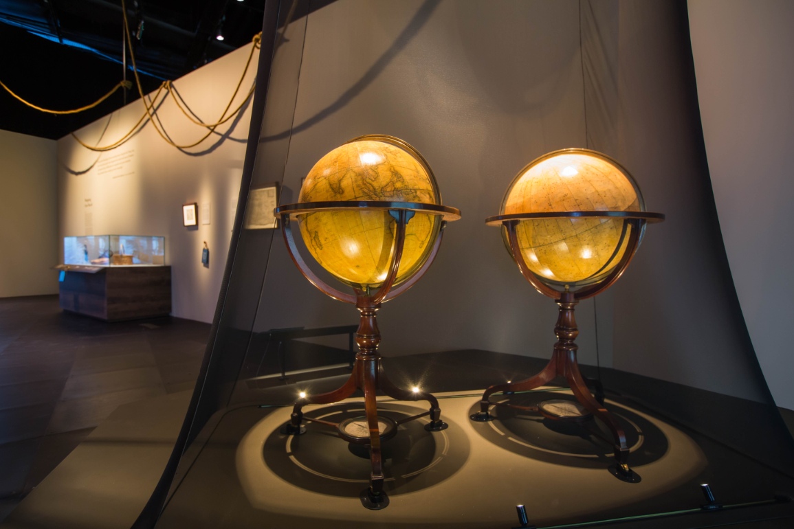
Melissa: There is a pair of 21-inch terrestrial and celestial globes that are more than 200 years old, made by J&W Cary. They show a view of the world then, exhibiting tracks and discoveries made by Captains James Cook and George Vancouver. We placed them under a mesh than a transparent showcase to reduce the distance to them. On the side, we have another pair of globes that visitors can spin and contains information about their antique counterparts. These have a digital encoder comprising a magnetic sensor to detect the angle of rotation, which then projects the explanation onto a screen.
2. Setting Sail
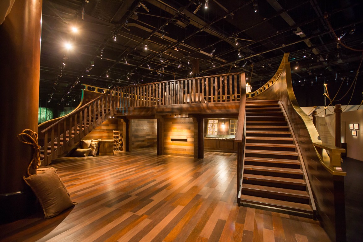
Melissa: This explores the networking of shipping connections which linked ports and facilitated trade. We installed a mock-up 90 percent to scale of an English merchant ship where the deck is used for programming.


3. Spices and Tea for the Market
Melissa: We thought it best to have visitors engage their senses, which is why on top of having a dedicated space for artefacts, we have a re-creation of a market area. We even commissioned a mural of a marketplace from an actual print from that time.
4. Natural History
Melissa: We tried to create a forest landscape by presenting the artefacts not on walls, but mounted on MDF boards and held up by metal poles. These are framed by a stiff mesh with a botanical print. An interactive element in this section is matching an ailment with a plant cure, made possible using RFID technology.
5. New Landscapes and Portraits
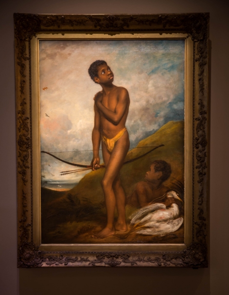
Daniel: This zone represents some of the artistic and documentary endeavours of amateur and official European artists. One of them is of a boy from Papua New Guinea named Dick, (painted by Thomas Phillips, RA) who accompanied Raffles back to England when he left. Whether Raffles bought this boy as a slave, or purchased his freedom — we don’t know.


6. Prelude to the Founding
Melissa: Here, we wanted to again emphasise the sense of journey, which is why we have a floor graphic representing Malaya. It brings you through the experience of when the British sailed through the Straits of Malacca and arrived in Singapore.
Daniel: It parallels with the historical development as well, where the British established settlements in Penang first, and then subsequently Singapore. We wanted to it to be slightly abstract. It’s not a literal representation. This results in a balance of contexualising but not taking it to literally. Just before you exit the exhibition, you can stand under a directional speaker and hear the English translation of an Orang Laut, Wa Hakim, narrating how he witnessed the arrival of Raffles.


 Share
Share
