Chinese architect Xie Suting, founder of JST Architecture, has completed Physical Geometry Exhibition Hall, a showroom for Fuzhou furniture brand Xinyi Meigu with a dramatic, geometrical design concept.
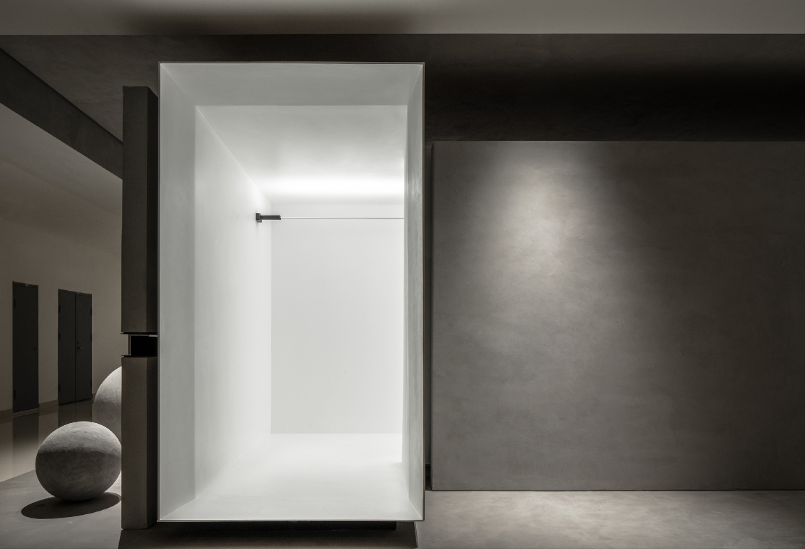
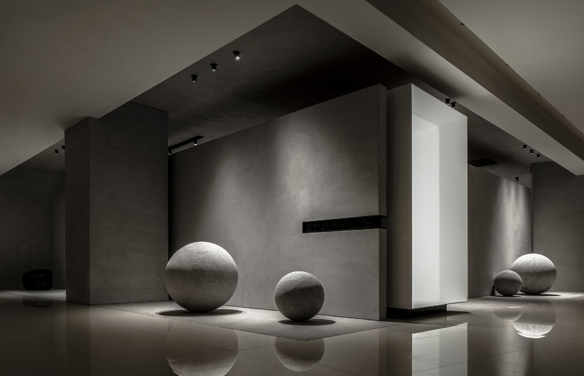
Rectangles and spheres come together to create an art gallery-like space. At the exterior entrance, an elevated white box serves as a hypnotic, entrance passageway into the showroom.
“Different from a conventional door, the long and narrow rectangular passageway acts as a transitional space and generates a sense of ritual for the people passing through it,” says Xie.
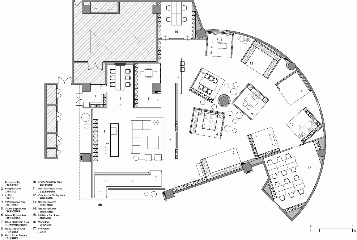
The original space was irregular with a layout that included many turn-offs, so Xie reorganised the floorplan, dividing it into a single, large rectangular zone that conjoins to a fan-shaped zone.


A reception area is located within the rectangular zone, which features a combination of framed structures that convey a sense of order.
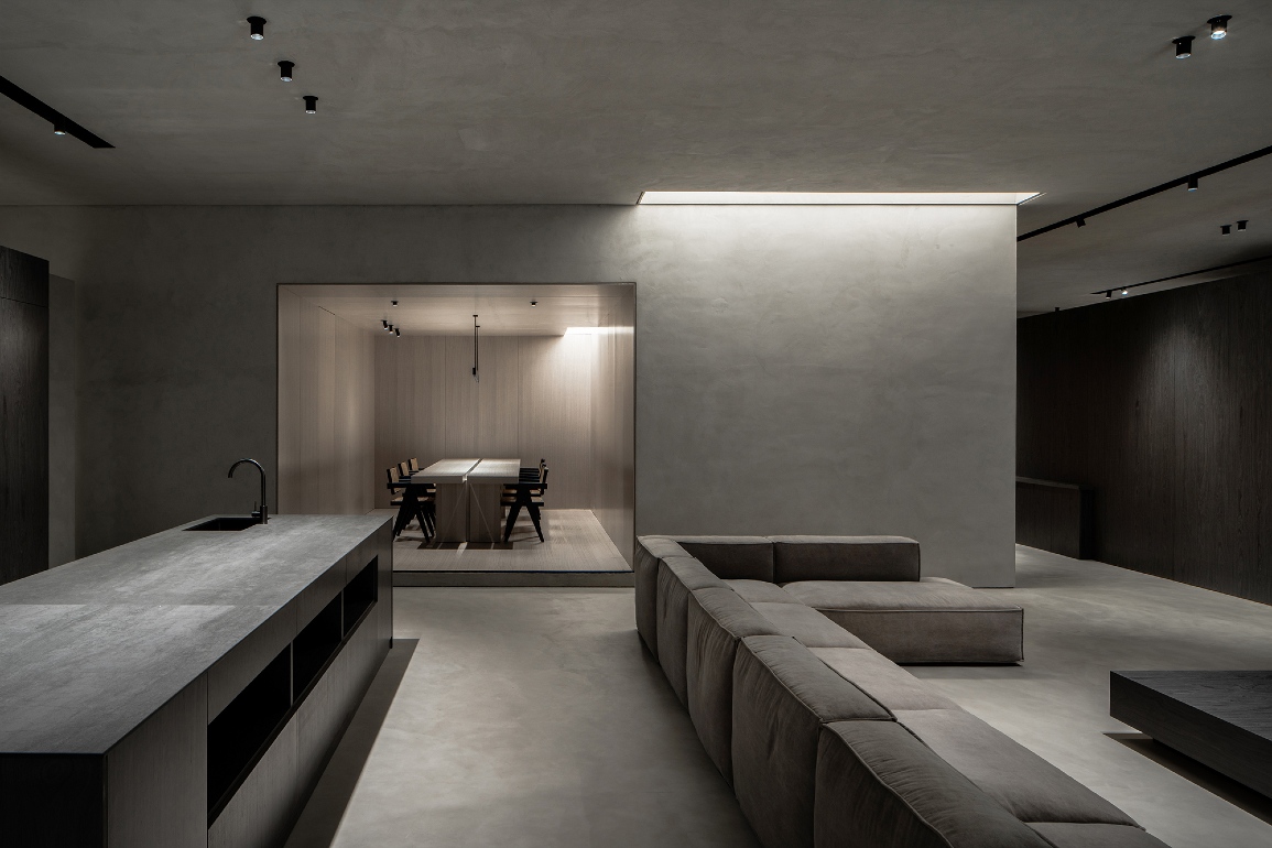
Within the fan-shaped zone are nine sample display areas arranged within a box-like structure.
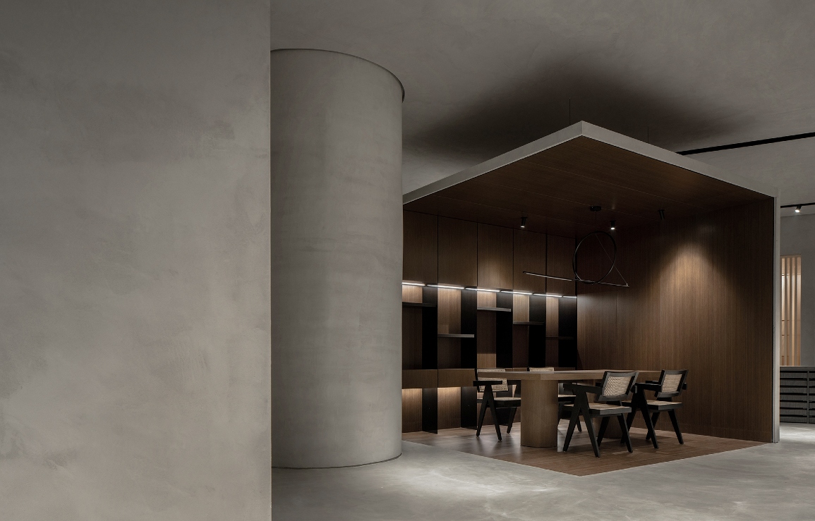
Set apart from the ceiling, these boxes are a mix of open and semi-enclosed. While they all stand alone, they are aesthetically unified by their distinct cubic form.
The two zones combine to give the showroom a very open and flexible layout that enables easy movement from one display scene to the next.
Exposed concrete walls and columns, together with wood veneer walls and ceilings, provide a backdrop that is ideal for showcasing Xinyi Meigu’s custom-designed furniture.


A monolithic, cylindrical, load-bearing wall softens the angularity of the box-like “cases” that contain the furniture mise en scene.
The monochromatic colour scheme gives the showroom a calm, minimalist atmosphere.
“Varied gray shades and textures bring out differentiated yet balanced visual effects,” says Xie.
“The contrast between the rectangular structures and spherical art installations injects playfulness into the space and also generates artistic scenes for interaction.”
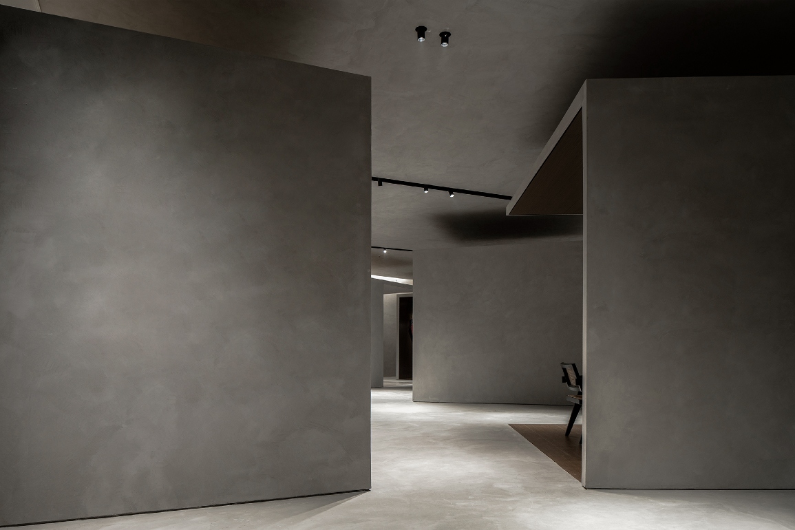
Set along the nodes of the display route are a series of partition walls that guide the circulation and enhance the textural details of the concrete.
“The partition walls create a twisting circulation route and a layered feel to the showroom, extending the space visually and enriching the user experience.
“Some of these partitions intersect with pre-existing interior architectural structures to reveal an asymmetrical aesthetic that adds diversity to the layout.
“The interpenetration and combination of curves and lines, as well as the transition between different material textures provide an immersive visitor experience,” says Xie.
The partitions separate different areas but also ensure a sense of continuity as the user moves through the showroom.
These partitions also create visual cohesiveness, acting as the medium that promotes interaction between the users and furniture on display.
Several illuminated, rectangular stretched ceilings were incorporated to mimic the effect of skylights.
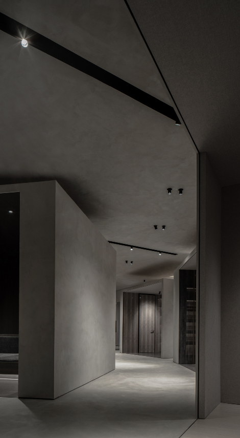

“The utilisation of spheres, rectangles, light, shadows, material textures as well as combined or cut frames and lines are based on a human scale,” explains Xie.
“The interior design strengthens the emotive and spiritual quality of the space, enhances how visitors interact with it, shows a pure state of life, and conveys the brand’s values to in a way that evokes spiritual resonance.”


 Share
Share
