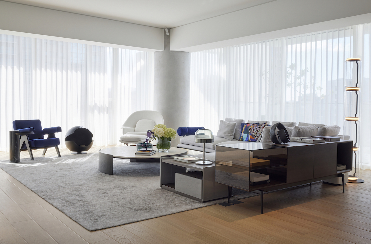
Located in Taipei’s financial district, within the iconic Xin-Yi residential skyscraper, is a high-end apartment designed by one of Taipei’s top interior designers, Celia Chu, Principal Designer of Celia Chu Design & Associates.
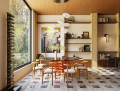
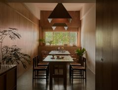
The apartment consists of a grand living space, a quiet room to relax in, an elegant dining room, a stylish master bedroom, a guest room, and a living room with floor-to-ceiling windows offering views of Taipei 101. It also boasts a range of beautiful features, including bespoke, full-height room divider doors, a freestanding flueless spherical fireplace, a curved finished wall in the master bedroom, and a freestanding bathtub and bespoke shelving in the master bathroom.
Inspired by a “magic box”
“I designed this apartment to resemble a ‘magic box’ of sorts, something that would help maximise the overall layout as well as appeal to the owner’s sense of adventure and need for flexibility,” says Chu, who is based in the Taiwanese capital.
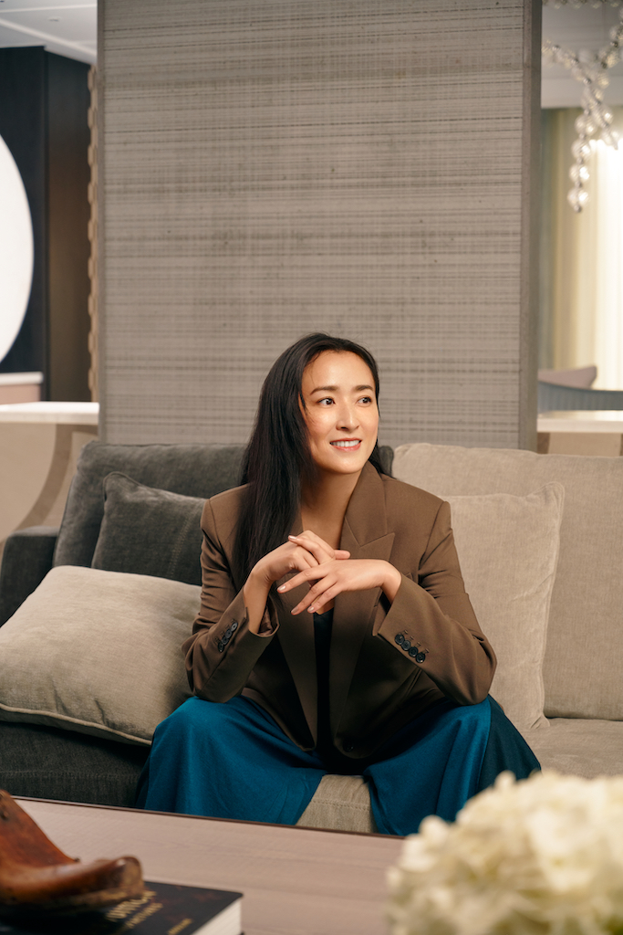

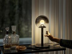
For instance, the guest bedroom features hidden storage and a TV that can be fully concealed at night with a full-height sliding door. During the day, the open kitchen serves as the perfect breakfast spot, but after dark, it transforms into a whisky bar, complete with a wine shelf hidden behind a black hairline-tinted metal wall. The ambient lighting from the glass shelf further adds to the fashionable and modern feel of the room.
“Instead of replicating something from our portfolio, I customised the design of the apartment to suit the owner’s preferences and lifestyle. My goal was to offer a versatile living space that could be open-plan or zoned as required. By simply opening or closing different doors, the owner can create different layouts and spaces as he wishes,” she says.
“Given that the client is young and single, I wanted a relatively open, loft-like environment that would allow him to enjoy his space fully,” Chu adds. “At the same time, I considered his needs and preferences over the next decade, including the possibility of him starting a family. Thanks to the versatile layout, he can reconfigure the space as needed in the future without feeling constrained by its original design.”
The art of storytelling
When designing the apartment, Chu, whose work is inspired by art, wanted to create something truly special as well as convey a meaningful narrative.
“I take pride in using my designs to tell stories, evoke emotions, and give individuality and depth to a project,” she explains. “In this case, the owner expressed a love for variation and a willingness to embrace innovation. I transformed his home to reflect this while pushing design and artistic boundaries.”
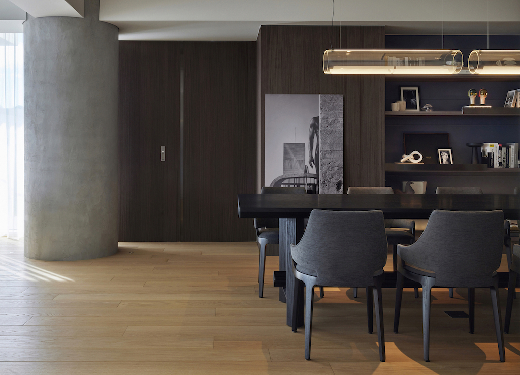
The interior design celebrates the three iconic cylindrical columns that stand proudly in the apartment. These circular concrete columns were conceptualised by American architect Richard Meier, who designed the building and who is well-known for his use of geometric designs and the colour white.
As Chu planned the layout of the apartment, she challenged herself to use these columns in a unique way, paying homage to Meier’s “design flow” while respecting the space constraints of the apartment.
To create distinct zones within the home, for example, she utilised the columns as natural dividers. To ensure that the interior design complemented the building’s white aesthetic, she incorporated the white colour tone of the columns, effectively linking the architecture with the interior design.
Additionally, she paid tribute to Meier’s design by incorporating a greyish concrete component, further emphasising the unique features of his architecture.
Curves and textures
The apartment’s interior architecture features plenty of curved shapes and lines beyond the columns. Chu selected modern furniture with soft, smooth edges, rather than cubic pieces, to help play this up. This approach, she notes, helps to bridge the gap between the architectural elements and fixtures, providing a cohesive and visually appealing space.
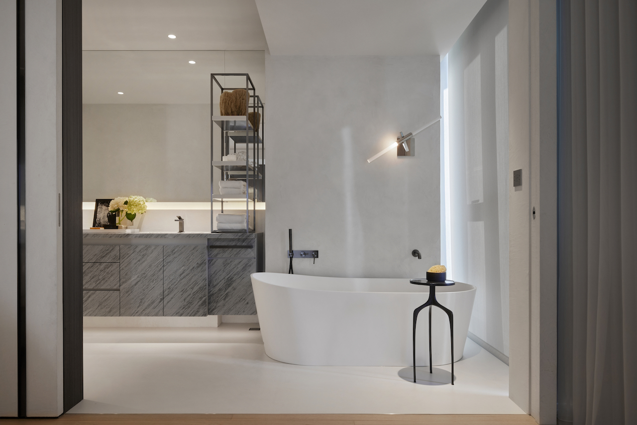
She also added texture to the walls as a complement to the concrete element of the design. In the master bedroom, she used a single finish wrap from floor to wall – but rather than conventional materials like marble or tile, she used specialised, locally made textural paint in a colour that matched the concrete columns.
Challenges resolved
As her client was the only resident in the building who retained all of Meier’s architectural columns, Chu was faced with the challenge of having to seamlessly integrate the structures into her design while still fulfilling his request for three bedrooms.
“It wasn’t easy, given the size of the original layout and the plan to create a spacious and comfortable environment. My ‘magic box’ design concept addressed this challenge by allowing me to create a more flexible space and accommodate my client’s wishes at the same time,” she shares.
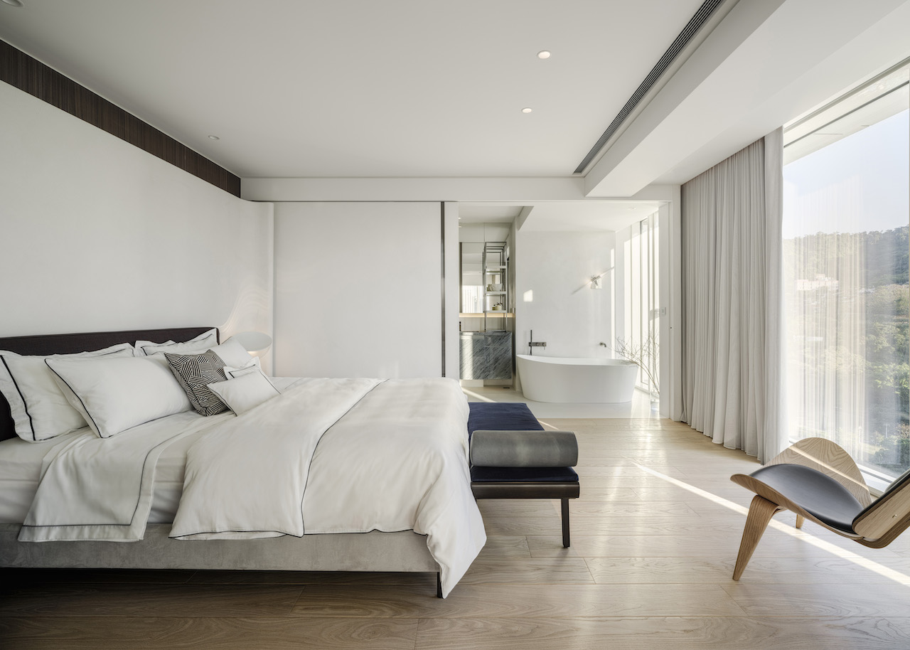
Another challenge that arose was deciding where to position the master bedroom. Traditional design principles would have placed it at the back of the apartment, in a quieter area, but this would have meant sacrificing the stunning views of Taipei 101. Chu therefore had to find a way to turn the front room into a comfortable and functional sanctuary for her client. Now, the owner can look out at the breathtaking Taipei skyline from his bed.
Amazing views aside, the apartment stands out for its brilliant use of space, which makes it a winner in a small but densely populated city like Taipei, where sizable dwellings are often hard to come by. The result is a truly luxurious, flexible and visually interesting abode that resolves space limitations while creating a feeling of expansiveness.


 Share
Share
