 Share
Share
Naumi Hotel Singapore has launched a new initiative where it partners with interior design students from local tertiary institutions to conceptualise a hotel room that appeals to the next generation of travellers.
Named Project 210 after the room number, the young designers are given a blank canvas to implement their designs to become the next “Project 210” space in Singapore – taking after the ethos of the designer-inspired rooms at Naumi.
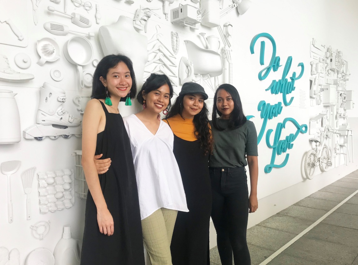
Refreshed every quarter, it kick-starts with a design by Nurul Hanis, Nia Astira, Nuri Khairiyyah and Tracy Lim, final-year Retail and Hospitality Design students from Temasek Polytechnic.
Why did you decide to participate in this project?
We saw it as a good opportunity to build up our portfolio because although we are doing a retail and hospitality design-centred course, none of us had the opportunity to do a real-life hospitality project before. It was exciting for us because we were taught essentials for hospitality design and we could finally put it to good use right before we graduate.
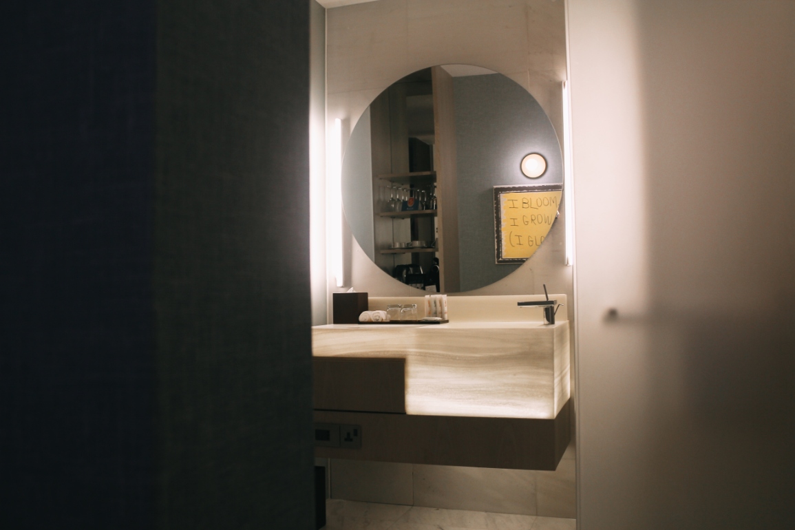
What is your design concept for Project 210?
Tyler The Creator is a creative personality in music, TV and fashion. His colourful and bold style is influential, attracting expressive and like-minded youths. His style is associated with 1970s street hip-hop with skate culture influences, and is making a comeback in today’s youth choices in fashion, music and general aesthetic. Street culture, locally and internationally is a big part of how youths express themselves these days.
Previously known to be extremely controversial and criticised, the lyrics of Tyler The Creator's latest album, Flower Boy, speaks about finding yourself and trying to find someone who values you completely. This album was pivotal to him as an influencer because of this transformation. In our design, we wanted to impart the idea that growth, when positive, should be celebrated and made a spectacle of.
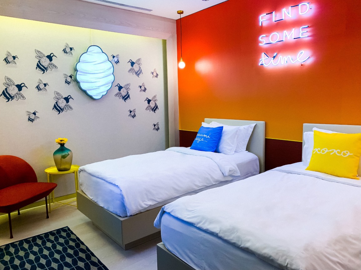
The interior includes a cacophony of colours from the album art that clashes in a disruptive manner. All this is done to promote the feeling of a dreamlike state and playfulness, which is the overall ambience of the album and his general persona.
Why did you pick Tyler The Creator as your inspiration?
We came up with a few names when we asked ourselves who do youths today look up to. No one really compared to how Tyler impacted movements in our own circle of friends. In design school, we dress to express and we saw that a lot of our peers dress LOUDLY and a lot of the elements that Tyler has incorporated into his fashion line, like colours and graphics, really play a part for these individuals to stand out in a crowd. We aren’t afraid of sticking out and blending in anymore; as creatives we like to be seen and heard. This goes as far as to other youths in Singapore too, because the hype and street culture is very much alive whether some may like it or not.
How does he translate into your design for the room?
We took inspiration from his latest album Flower Boy. The message he sends to the audience, we feel, is very important in this fast-paced lifestyle today. The positivity around change and growth is celebrated by many and we feel that it is a very important message. Colours and graphic elements make the room feel very dreamlike, down to the yellow colour of the skirting on the walls; we wanted people to feel like they aren’t in any ordinary room.
What is your definition of a space being "Instagram-worthy"?
It’s what looks good on that tiny square or rectangle on your phone. Everything down to the lighting and materiality of what fits in that frame is important. The rest of the room can be dull but that one corner of what we call an “aesthetically pleasing” photo is very important. The room is basically a mish-mash of what we found people took pictures of on Instagram. Neon signage, colour blocking, modern art deco lamps, a round mirror, it really is a manifestation of the ‘Explore’ page on Instagram.
How does it manifest in the space you've designed?
We tried our best to merge these elements with our concept and colour scheme to make it somewhat simple and straight forward. We included many background graphics and different lightings to help set the mood for anyone who wants to get a good photo for their Instagram account. From the mirror-imaged canvas print, to the hive and the bees, as long as they can find the right angle, their photos can be Instagram-worthy
What were some of the factors you had to consider in coming up with the design concept?
Time was our biggest challenge. We had a few days to come up with a draft, and about two weeks to finalise the design to make it in time for [the launch date of] Singapore Design Week. Our production period was around Chinese New Year, so we had to crack our heads as a team to churn out designs and liaise with Naumi for approvals. We had to come up with something that solves the issues of the room that fits within the timeline. Another concern was if the design was too loud for guests. We compromised within ourselves to come up with something palatable for everyone. We hope we did a good job at that.
Where do you think the future of hospitality design is headed?
Trends are constantly evolving and we think that designers need to keep up with these changes to appeal to consumers. We personally feel that the younger generation aren’t interested in things that are too general because they want their individuality validated. People like to feel like they belong and not to feel like they have to minimise themselves to fit.