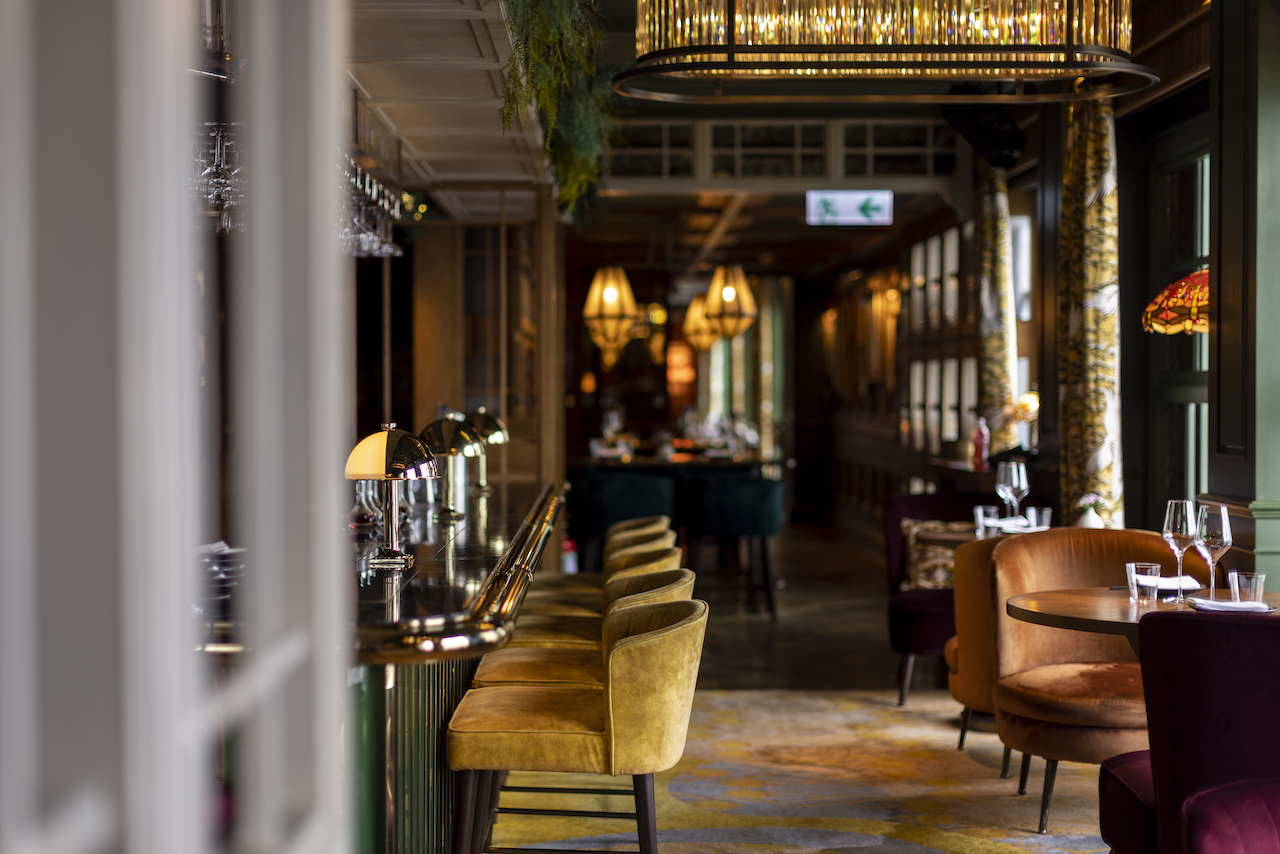
The Aubrey is an elevated Japanese izakaya perched on the 25th floor of The Mandarin Oriental Hong Kong. The original space was occupied by Pierre, a fine dining French restaurant by renowned Chef Pierre Gagnaire. After a major transformation, the establishment now has three distinct bar areas: The Main Bar, The Omakase Cocktail Bar and The Champagne & Sake Bar. It’s also ranked no.17 on Asia’s 50 Best Bars 2023.
To create this concept, the hotel collaborated with hospitality group Maximal Concepts (best known for developing Mott 32 restaurants). Singaporean interior architecture firm Silverfox Studios was tasked with the interior design. The result is a dramatic space with interconnected rooms and intimate private nooks, complete with colour, texture, and fabrics.
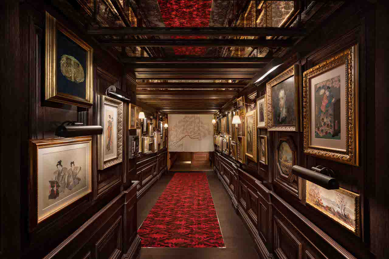
Matt Reid, Maximal Concepts’ Director and co-founder says, “This was a complete reimagination of the use of the space including reducing the size of the allocation to the kitchen. We also wanted to change the arrival journey.” Guests enter The Aubrey via a dark, wood-panelled corridor adorned with ukiyo-e prints (colourful woodblock prints) and impressionist paintings. “Of course, the four walls remain almost the same, so everything we changed was within the confines of the original space.”
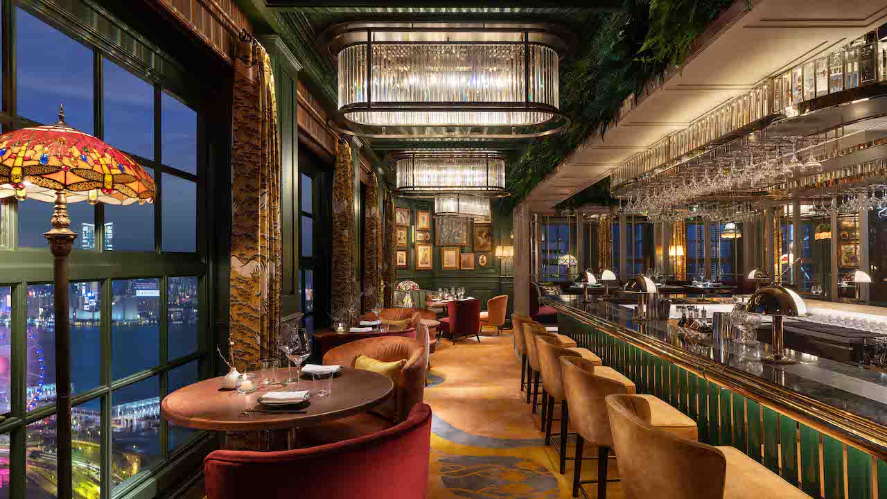
“We wanted to create the feeling and sense of relaxation one feels when in a home as opposed to a restaurant. I think one can draw parallels to private clubs that achieve this [ambience]. Once we thought of the space as a home, it led us to the various rooms such as dining room, drawing room, curio lounge and bar (which is akin to a kitchen) – each with its own distinctive vibe and character,” Reid points out.
He adds that the design concept was to create a home, resembling one in England, and owned by an art collector who’s obsessed over Japonisme artworks. The art is largely inspired by Aubrey Beardsley, the influential British illustrator known for his black ink drawings influenced by Japanese woodcuts.
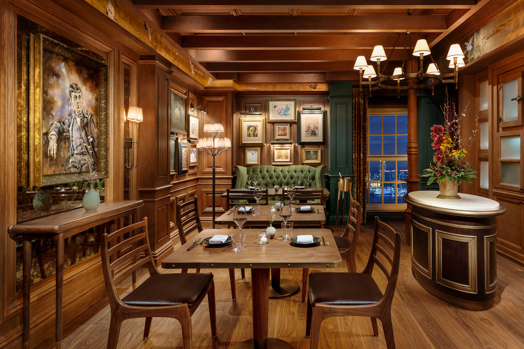
The Aubrey boasts an art collection of ukiyo-e and Japanese art sourced from auctions around the world as well as commissioned oil paintings and first edition books that borrow from the Japonisme movement. All ceramics have been designed by contemporary Japanese artists, and the vinyl collection includes 500 Japanese records.
“We have sourced over 150 unique pieces of Japonistic art from all over the world. Each piece is unique and some are hundreds of years old. We commissioned specific works on Aubrey Beardsley and his sister Mabel, whom he had an intriguing relationship with. We also borrowed some art from talented artists we know in Hong Kong, including some incredible pieces from Jane Chao,” says Reid.
Like many dining outlets in the city, The Aubrey was born in the times of COVID-19 (completed in 2021). “This created immense sourcing challenges and in fact, the interior designers never stepped foot on site from start to finish,” shares Reid.
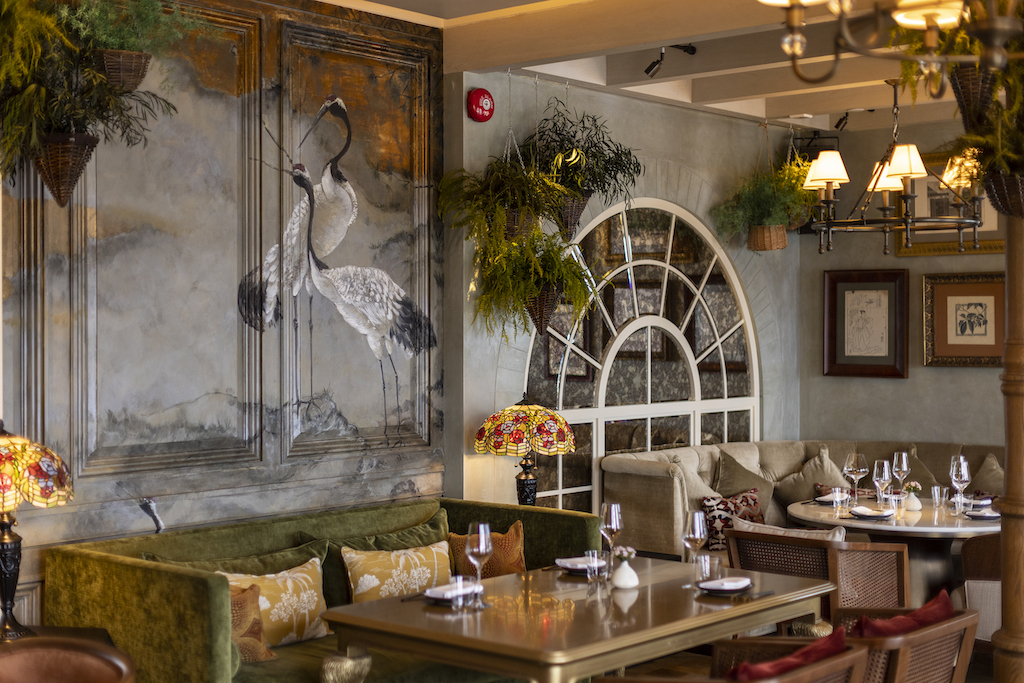
Materials-wise, the design team sourced a lot of the fabrics locally. “We worked with Amy Walsh, our art director and we designed all the carpets ourselves, which truly elevated the floor. The choice of materials was always focused on being on the mind of the eccentric art collector. The obsession for all things Japanese had to speak in the material choice.”
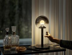
The lighting of any bar is highly important to set the mood. The Aubrey needed to be a space that’s suitable for guests to visit throughout the day. “Our design strategy on lighting was to create a sultry environment that drew on the story line of the design,” says Reid.
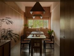
For furnishings, the designers chose predominantly comfortable low soft seating for this all-day drinks and dining outlet. The tables are oversized to accommodate shared dining.

Instead of the typical floor-to-ceiling glass windows that take advantage of the views, the designers did something daring. “We actually did the exact opposite. This was our most bold design decision, and I would argue the most successful aspect of the final design outcome. We believe that having large wide-open windows sucks all the energy out of the space. We intentionally reduced the size of the windows and built wooden structures in front of them, similar to a Georgian mansion bay window,” shares Reid.
He adds, “We wanted the view to become an element of the design experience, but not the primary reason for visiting The Aubrey. We felt that the impact of this change creates some of the best tables to not need to have views. And in fact, this locks the energy into the experience, whilst of course still offering glimpses of Victoria Harbour across the space.”


 Share
Share
