Chinese-Dutch design studio Office ZHU has just completed the renovation of a double-storey residence in Taicang, Jiangsu in China. Set on a heavily landscaped, wide street, it is a welcome retreat from the stressful, high-octane lives the owners lead in nearby Shanghai.
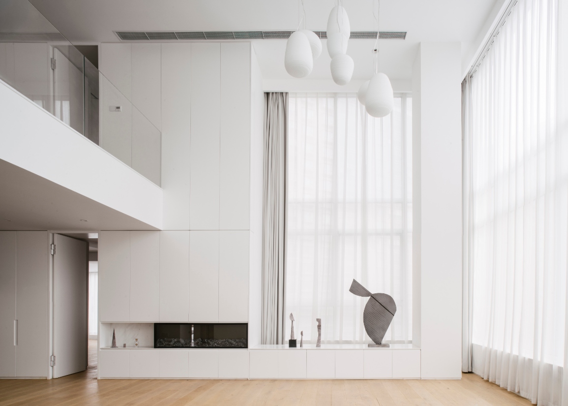
Office ZHU is helmed by its founder Wang Zhuoer. Inspired by the building’s existing high ceilings on the ground floor, she retained this element, thereby allowing light to flood the living room of the project she named TC Apartment. Complementing it is a minimalist style with a predominantly white palette.

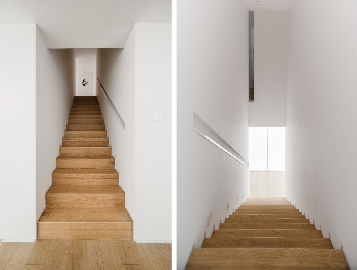
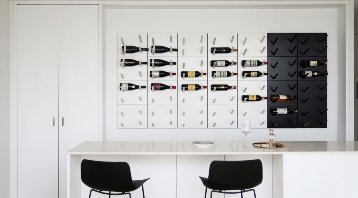
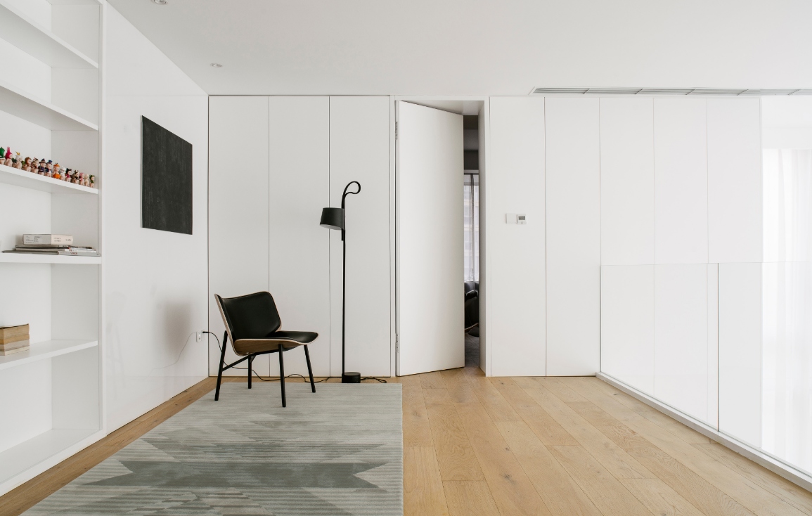
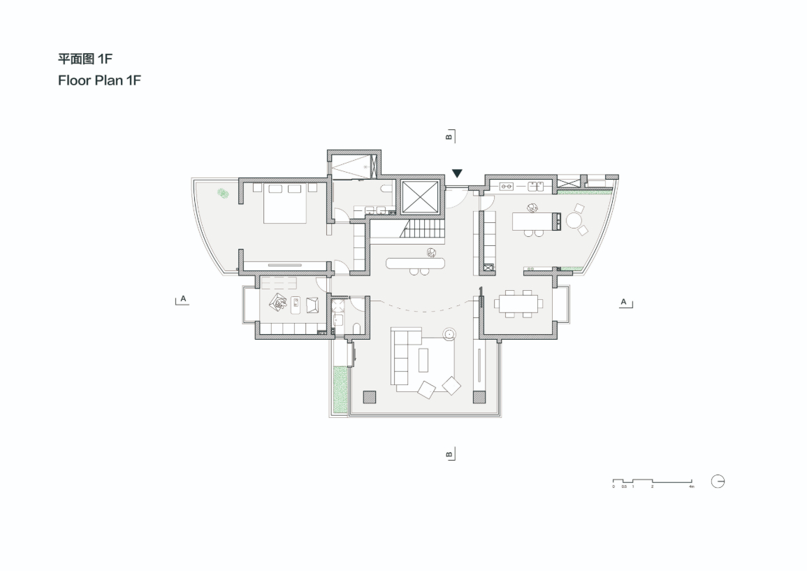
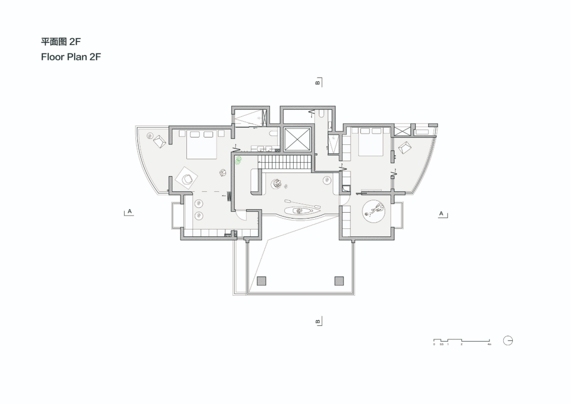
One of the first decisions Wang made was to compress the width of the stairwell into half, freeing up space around it. On the ground floor, the new area was turned into a bar, complete with one wall installed with a system to display the wine bottles at. On the second floor, it became a library lined with book shelves overlooking into the living room.


Wang went on to reduce the number of walls and sliding doors, leaving only the barest minimum to optimise the house’s capacity. Doors measure from floor to ceiling to accentuate the height of the space.
To further reduce obstruction of any kind, carpentry work was restricted to the perimeter of each space, and low-height furniture were used to define functional areas. This also allowed light to enter the home seamlessly and provide ample air circulation between rooms.
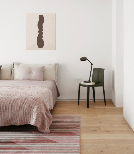
The neutral colour palette of white is accented by grey and black. Wang also splashed nature-inspired colours to lend the spaces some warmth and reflect the clients’ bubbly personality. These include carpets in green, poufs in brown and pink, and a sofa in grey.
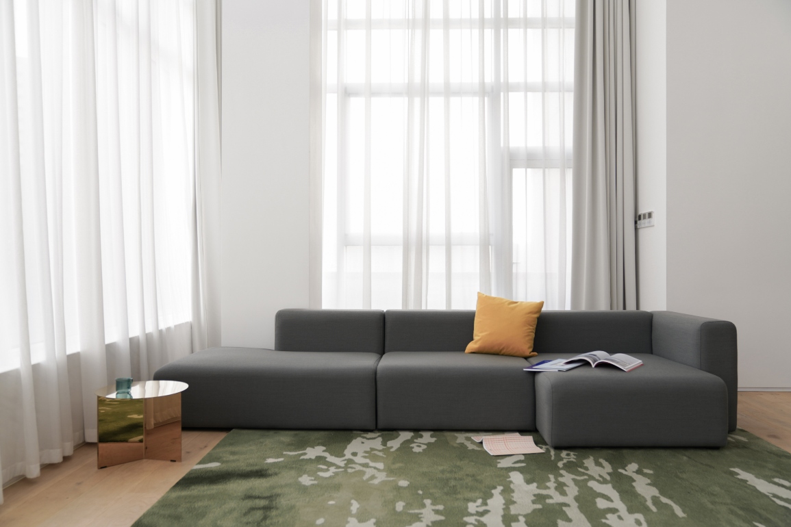
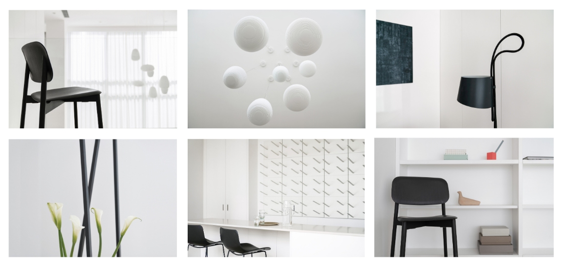
The choice of furnishings was an important consideration in rounding out the overall design strategy of TC Apartment. Statement lights and chairs were selected to create vibrant visuals, contrasting with the clean lines of the home.
In the rooms, the furniture like pink and grey carpets were selected for their colour schemes and rounded shapes to make the spaces warm and inviting. In the common areas, designer brands were handpicked for that touch of luxe. These included lamps from Foscarini and a lounge chair from Danish label HAY.


To add a personal touch, the clients produced small sculptures and paintings to adorn their home, completing the final aspect required for a cosy family oasis that they can escape to.


 Share
Share
