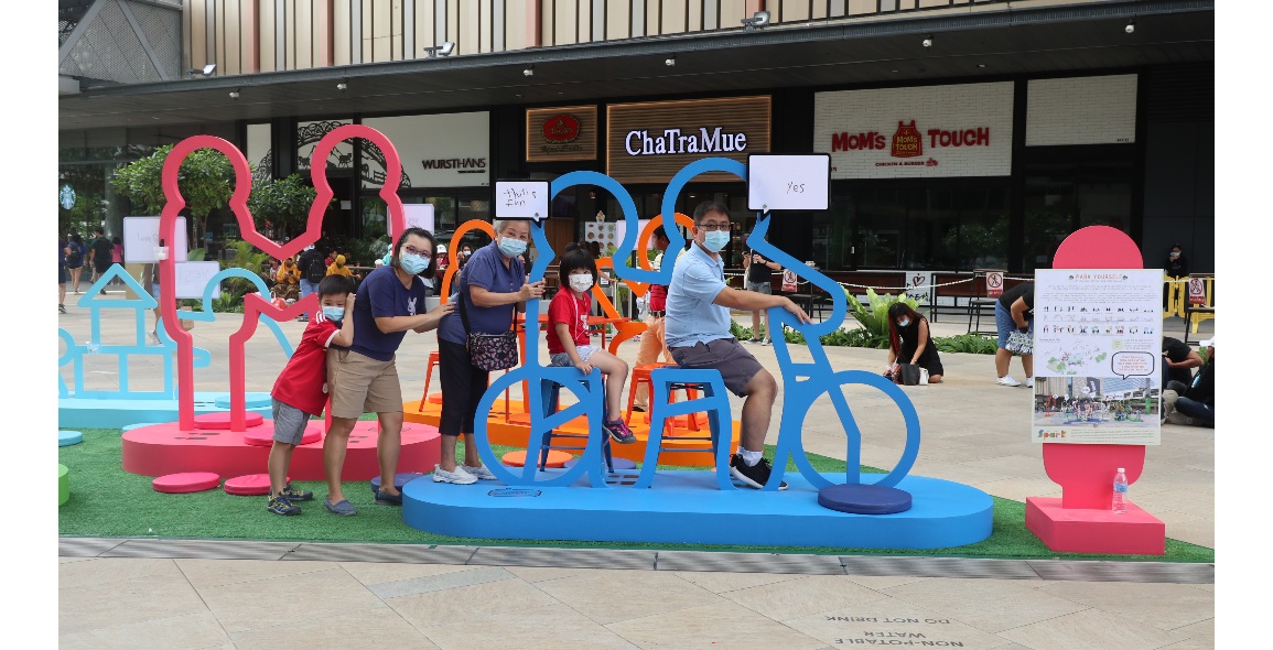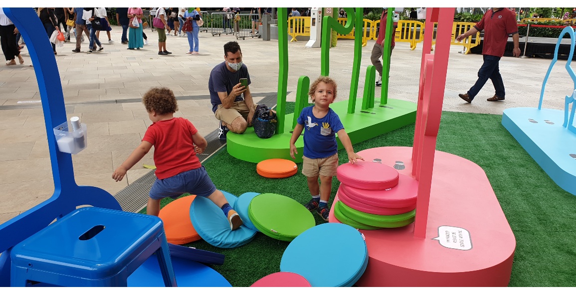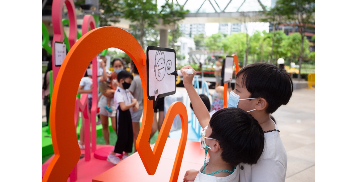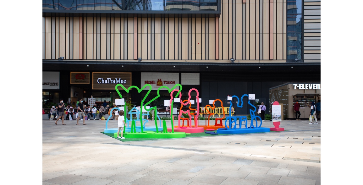
If you were in Paya Lebar Central recently, you might have noticed a colourful installation in the plaza of Paya Lebar Quarter (PLQ).
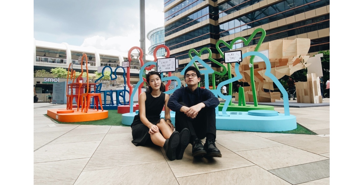
Designed by architect Jonathan Christian Chin and landscape architect Pearlyn Chang, it is called Park Yourself and set out to put the “social” in social distancing.
So successful was the concept that it won the URA-REDAS SPARK Challenge, a competition that seeks to improve the quality of the urban environment in Singapore.
“The concept for Park Yourself was particularly well-executed,” says REDAS (Real Estate Developers' Association of Singapore) President, Chia Ngiang Hong.
“It led to a lively and immersive installation that was well-received by mall visitors of all ages, transforming the shopping experience at the development into a shared and memorable one.”
We caught up with Chin and Chang to find out how they came up with their winning concept and what advice they would give to other designers to follow in their footsteps.
How does Park Yourself respond to the brief of the URA-REDAS SPARK Challenge?
The brief for the URA-REDAS SPARK Challenge, themed Enlivening Public Spaces, was aimed at creating well-loved public spaces that provide opportunities for bonding and interaction.
Our modular installation was designed with that in mind, encouraging people to come together, interact, take photos and generate buzz within the space. It is a vibrant urban park that generates activity through interactive play, activating the site both physically and virtually.
With the use of bright bold colours, the frames and colour-coordinated furniture create an attractive backdrop or “Instagrammable” place. In terms of placemaking, the colourful frames of the installation is in itself a public art sculpture – an icon for the vibrant Paya Lebar district, while serving as a recognisable public nodal point. By activating the social media presence of the site, it provides marketing opportunities for the neighbourhood.
How did you come up with the concept for Park Yourself?
During the pandemic, we realised that a lot of public spaces and playgrounds had to be closed off. So we asked ourselves, “How can we design an installation in a public space to bring people together in a pandemic situation, while maintaining social distancing?” This was the genesis of the concept for Park Yourself, which is a playful series of Instagrammable “people parking lots” to engage people in various play and rest positions, while maintaining social distance.
We wanted it to be interactive, activating, a vibrant icon for placemaking, while being modular and adaptable to the various different public space typologies. We envisioned it to be a playground for creative expression and endless photo opportunities, bringing the social into social distancing.
How did it transform from concept to the physical installation that is Park Yourself?
We first conceived a series of common duo activity positions, including having a coffee break, couple shaking hands, riding a tandem bicycle, children playing and dancing poses etc. After drafting the silhouettes anthropometrically, we printed the shapes on a 1:1 scale paper mock-up and tested them out within the neighbourhood void deck. Pinning the shapes on the wall, we got strangers to stand within them to ensure that the figures fit the average adult/child.
One interesting anecdote was that we had originally designed a handshake module, which was converted to a holding hands module during this process; we then realised that the natural reaction for couple poses was to hold hands instead of shake hands, so the shape was adjusted accordingly.
Further modifications were also made when working with the contractor, Allmaster, to ensure structural stability. For instance, the dimensions of the frames were adjusted to match the sizes of the tables and chairs we procured from Carousell and Taobao, such that the furniture can be integrated into the frames. The frames, furniture and cushions were all colour-coordinated in bright, bold colours to enhance its appeal.


What is the installation made of?
The frame is made of plywood, in various thicknesses (15mm, 35mm, 60mm) according to the structural stability of the design, while the podium base comprises of a plywood waffle configuration cladded in plywood. The frame was coated in outdoor-grade waterproof paint, colour-coordinated to our tables, steel stools and loose cushions. The mounted white acrylic pieces in the shape of speech bubbles serve as erasable surfaces for creative expression, where people can scribble messages or sketches.
What were some considerations that went into the installation’s design?
We wanted the installation to be interactive and dynamic, yet reduce reliance on energy. Hence, we determined that the people and how they use it would become the source of its transformative experience, as the installation takes on a different look with its users.
In terms of the modules, the most fundamental consideration for us was the anthropometry of the frames, as it had to be designed to the human “scale”. The height of the podium base for example, was set at a height of 150mm to 200mm, similar to a typical step riser to minimise tripping hazard, while doubling up as a platform for sitting. The speech bubble boards were also placed around chest level and below for ease of writing. Footprints were provided to guide people on where they should stand for the best angle.
Site considerations were more specific to our context of locating it within PLQ’s Fountain Plaza and Paya Lebar Square, as we had to ensure that our installation was vibrant and attractive, yet remain porous to account for wind and maintain the visual sight-lines for the retail frontage. The orientation and layout of the modules were also arranged to optimise photo angles and create a suggested enclosure for the space. Artificial grass was chosen as the base carpet to create a conducive park-like setting.
Interesting story: initially we had also thought to sew down cushions for fear that they might be stolen or missing. However, during our soft launch we realised how much fun the children were having moving them around and building “pillow forts" and “stepping stones”. We decided to leave them as loose items and are pleased to share that all cushions were accounted for at the end of the installation – attesting to the civic-mindedness of the community.
How do you feel about the public reception to Park Yourself?
It was heart-warming to see the enthusiastic response from the public. The amount of footfall on weekends especially, did exceed our expectations. We hung out every weekend at the café facing PLQ plaza to people watch, and saw lots of families with young children and groups of friends interacting with our sculpture. There were children getting excited when they saw the sculptures from afar, some having fun tossing and stacking our cushions, drawing and running all over the installation. Some nice messages were spotted on the installation, such as “The place to be happy is here,” which affirmed our efforts.
Posting our work on social media, our Instagram content went surprising viral with an outreach of 29,500 and counting. It had garnered interest among some content creators and urban photographers, and we were also featured by Little Day Out, a website for activities for young families. Seeing its success and appeal, some organisations have also expressed interest in collaborating with us for other sites. We are extremely grateful for such an experience, from being able to bring our ideas to life, to witnessing people create memories within our installation.
What is the most unexpected reaction that you are aware of from the public towards Park Yourself?
We were taken aback when we first observed kids doodling onto the frame itself, and had a debate among ourselves on whether to clean or embrace it. Although the marks can be wiped off, we left it on as we loved that it reflected the stories of the community. In fact, after encouraging the creative expressions, it drew larger crowds who were intrigued by what others had drawn/written.
As for the undesirable expressions, we were heartened that there was a bunch of righteous children who helped to censor the words for us on their own, restoring our faith in the civic-mindedness of the people.
What would you say to other designers to encourage them to think up of such concepts for their projects?
Keep it simple, but be bold. Little did we know that our simple idea would be so well-received by everyone. It may not be complex construction or abstract art, but it is definitely relatable and easy to understand by all ages and all walks of life, which was why it could take a life of its own. Beyond the product, focus on designing the design process. It should help to communicate your story and you should have fun doing it!
What would you say to developers or planning authorities to encourage them to commission more of such projects for our built environment?
The URA-REDAS SPARK Challenge is definitely an excellent opportunity for creating interesting spaces for the community. As designers, we see lots of under-utilised open spaces that have a lot of potential for designing something for sitting/resting or perhaps an interactive sculpture. We believe in engaging the community in designing their own precinct and contributing creative ideas for the built environment. This will help to enhance the sense of identity/ownership/stewardship and strengthen neighbourhood ties/bonds.
How do you plan to leverage off your win at the URA-REDAS SPARK Challenge?
Winning has helped us generate more buzz and publicity for Park Yourself. We have been very honoured to be invited to give talks to students on public space design, share our design strategies and spread our ethos.
Through our win, it has affirmed our belief that Park Yourself is a successful prototype for how to activate public spaces and enliven them. We hope that we can scale this prototype to a version two, and for it to be placed at as many under-utilised environments and diverse locations as possible.
In this context, we managed to secure a permanent home for the installation at Marina Square, at the outdoor terrace and the indoor corridor beside Pororo Park, which synergises well with the children amenities in the mall. Now you can Park Yourself against the skyline of Marina Bay!


 Share
Share
