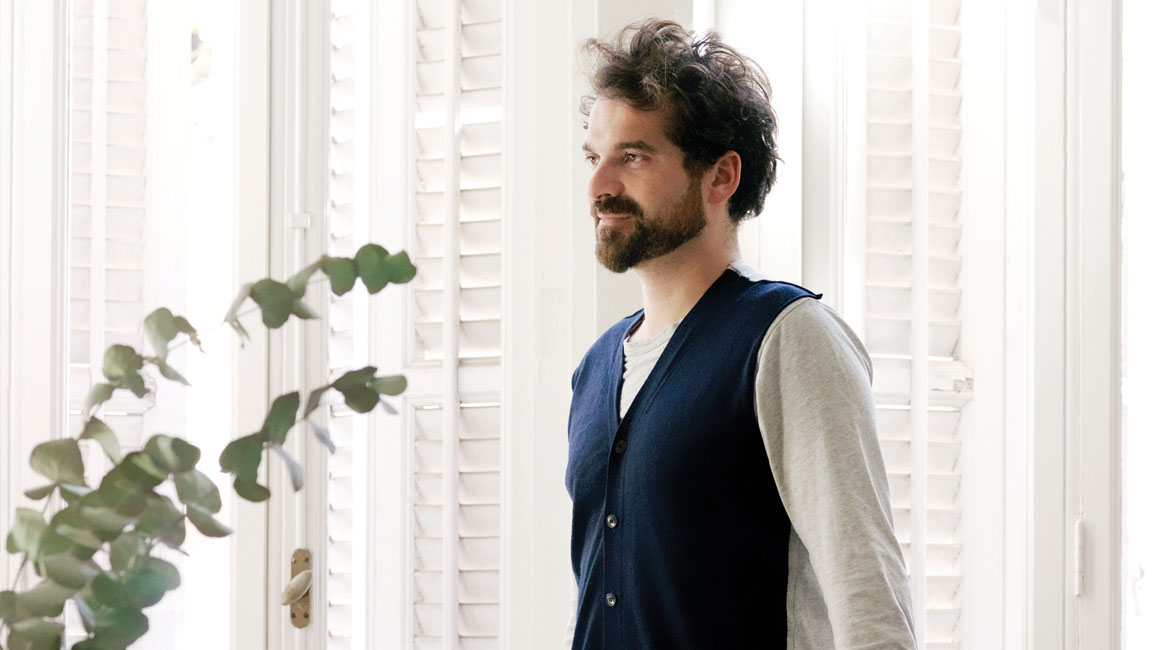
For all his awards, accolades and successes, Jaime Hayon is remarkably down-to-earth.
After a press conference in Jakarta, where he presented his first-ever sanitaryware collection designed with TOTO, a colleague and I wave him over to a table we are sitting at, hoping to have a chat.
The 45-year-old Spaniard complies without batting an eyelid, seemingly not bothered by our casual manner.
Speaking perfect English with just a hint of a Spanish accent, Hayon is forthcoming about the project, which, more specifically, is done with PT Surya Toto Indonesia (STI), the result of a joint venture with TOTO Ltd Japan.
“They feel like a little family but they’re actually a big corporation. It is amazing how despite the company being so large, I talk to the owner face-to-face,” he enthuses, when asked about the best part about the project.
“It’s so beautiful to see how they love the company and project. In Europe, you never talk to the boss.”
The artist-designer can say that with much authority since his client list is dominated by European companies. These include the likes of Baccarat, Cassina and Swarovski, for which he creates furniture, lights, home accessories, artworks and even interiors.
A close to two-decade career has seen him make Wallpaper magazine’s “Top 100” list, and be lauded as one of the most creative icons by Time magazine.
This kaleidoscopic universe Hayon resides in might sound dizzying but somehow, he is able to make sense of it, “It’s how I think. I don’t compartmentalise. Creativity is a flow of ideas that can be adapted to many realities.”
This flow of ideas is mostly encapsulated in what is today a mini library of sketch books. “I have 300-400 of them,” he says. “Sketching is such an integral part of me, that it is like a body part related to my brain, an extension of whatever I am doing.
“I sketch to think and to imagine how anything can be – from lists, to more free-sketching, to things I see around me, or to whatever is on my mind at the moment. There are many reasons and contexts for sketching and each is a singular need or reflection.”
Striving For Simplicity
Putting pen to paper is also part of his design thought process, and it was no different for the TOTO by HAYON collection, “The starting point was the harmonic line: a simple product that is decorative and functional…I used curves and forms [found in] furniture and sculptures.”
This theme is dominant throughout the different pieces, whether it is the toilet, flush, sink, faucet, showerhead, mixer or spout. Each item is stripped down to the simplest expression, with consideration given towards tactile quality.
He also plays with colour – offering the pieces in rose gold, brushed nickel and matte black and white, in addition to the more common chrome.
Hayon reveals that the biggest challenge was “to find a way to express myself in such a technical project”.
“For TOTO, technicality comes first. They are like surgeons. But when I make a product, I think about the design first and how it’ll look in my project. I don’t think about the mechanism,” he admits.
To overcome this, it took many discussions where each side spent time understanding the other’s perspective, “I think I was able to try to be myself as an artist and free mind, while fulfilling TOTO’s expectations.”
The showroom in Jakarta where the collection is displayed is both fun and colourful; what Hayon describes as a “combination of elegance, modernity and playfulness”.
A mirror with “ears” is hung on an orange-coloured wall. Below it, a pair of his-and-her sinks are paired with an inverted J faucet. In a corner is a wall-faced toilet, set in a way that you cannot help but think of a pelican (which is Hayon’s intention).
“I’m not a typical designer. I try to design objects that make you smile than cry, that carry some narrative.”
But more than anything, they are simple. It is a word that comes up repeatedly during the chat, almost to the point of obsession.
“Because it’s the hardest thing to do,” he explains.
Scenes To Inspire
Four days later, we meet again, this time in Singapore, where he is there to launch the standalone Fritz Hansen store located in Tan Boon Liat Building, in collaboration with W. Atelier.
While the subject this time is about interior design, Hayon is no less eloquent. He shares about how when he first saw the space, it was “very industrial” with no views to speak of.
But with a luxurious 400m2 to play with, he knew he could push the boundaries, “I thought about what I hate in a shop that sells furniture and I did the opposite.
“There are usually a lot of products and no composition. I wanted to create scenes that people will definitely get inspired by,” he points out, as he walks me through the store.
This means there are five rooms, fitted out with furniture from Fritz Hansen and accessories and art by Hayon, but each with a distinct identity.
For instance, there is an olive-green room with a sofa set placed alongside an office table and chairs, bringing to mind a private office.
Another has an earthy, terracotta colour on the walls, fitted out with a sofa and dining set, emulating a private home or a boutique serviced residence.
Increasingly, this is the direction that many furniture brands are taking. But true to his unique style, Hayon takes things a step further by adding “layers” to the showroom.
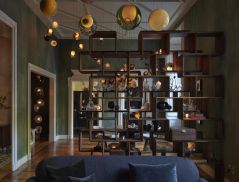
“I didn’t want to block anything, to be able to see right through the showroom, so I created these artistic grids that look like a face or a pattern. They act as dividers but also helps you frame the rooms when you want to take photos.”
The only exception is at the entrance and in a tucked-away corner of the showroom, which displays a selection of chairs and lights Fritz Hansen retails. The middle portion is carved out for a show kitchen and dining set where the brand can cater for private events.
“When you’re inside, it’s not messy. It is calm, inspirational and feels real,” he says, pausing within yet another scene that has a plush white sofa which could fit into a penthouse.
Suffice to say, Hayon has achieved what he set out to do. Little is left to the imagination of how Fritz Hansen’s pieces can be used in an interior design project.
“I am proud about not sticking to easy and to continue looking for new challenges,” he adds, in retrospect.
And there it is again – Hayon’s unabashed authenticity. Because he could very well rest on his laurels and adopt airs but he does not, making him all the more genuine and a joy to talk to.
This story first appeared in Issue 111: August/September 2019 of d+a.


 Share
Share
