"You write to communicate to the hearts and minds of others what's burning inside you, and we edit to let the fire show through the smoke."
Arthur Plotnik, journalist, author and librarian
Architecture as a medium makes us remember, reminds us to remember and inspires us to remember.
Print design publications have a paramount role in this journey of commemoration and reminiscence.
They record, maintain and shape histories of the creative industries and in particular architecture.
In providing an archival yet current stage for sharing contemporary discussions, they also become a record of objects, events, practitioners and snapshots in time.
Hence, the importance of the print media cannot be underestimated, even in an era supercharged by rapidly changing disruptive technologies.
Print is definitely much more successful at being immersive in an age of adblocking.
There is something uniquely intimate and tactile about reading on paper, which appeals to part of our human needs in a way digital media never can.
Long before the economic impact of the Covid-19 pandemic, the surge of online platforms had already decimated the print media and journalism industry.
We now mainly consume design images and facts through these sites.
We expect instantaneous content and constant visual titillation, but less thoughtful long-form opinions and serious design writing.
Most print publications, if they survive this seismic disruption, have no choice but to devote a large portion of their budget to their interactive, community-based digital platforms.
As a result design journalism has struggled to monetise quality writing in the course of this profound paradigm shift of the past two decades.
Remembering the big players
When I started writing for several design magazines during my undergraduate days in the early 1980s, there were only a handful of periodicals focused on design.
Some were staid trade journals, while others were esoteric professional newsletters; the rest were general interest magazines that sometimes covered architecture.
Among the most prominent local magazines then were Interiors Quarterly and Home and Decor.
Their content focused on selected residential projects, mainly interiors, with graphic documentation, highlighting the narrative backgrounds of the projects.
These titles also played a leading role in the renewal of graphic design in the 1980s.
There was a tendency to experiment with mixing typefaces and depart from the ubiquitous grid-pattern layouts.
Design-wise, interiors and design objects were flamboyant, whimsical and eclectic during that period, epitomised by the popularity of the Memphis Group and its founder Ettore Sottsass.
The pastels of post-modern interiors were the antithesis to the contemporary obsession with the bland palette of today’s minimalism.
Competitions from prominent international publications included real big hitters like Mimar: Architecture in Development and Blueprint.
The former was first published in 1981 and was the only international architecture magazine focused on architecture in the developing world.
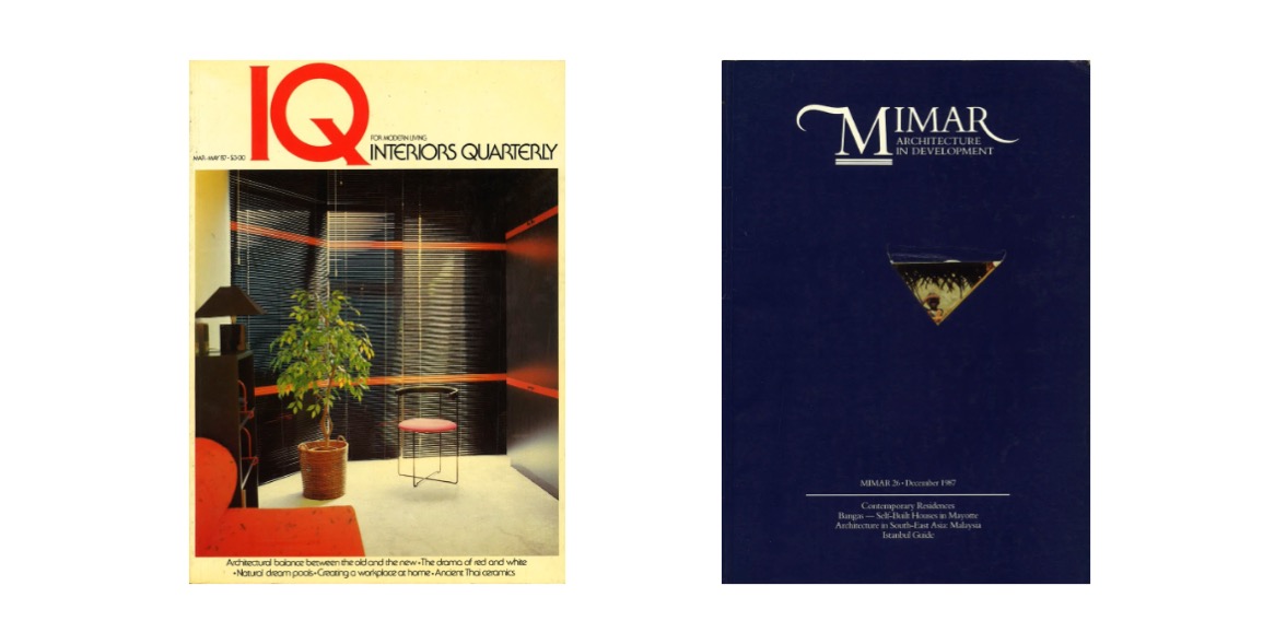
The latter was published in 1983 by art critic Deyan Sudjic and was a breath of fresh air in the way they achieved freedom in their written word and graphic layout.
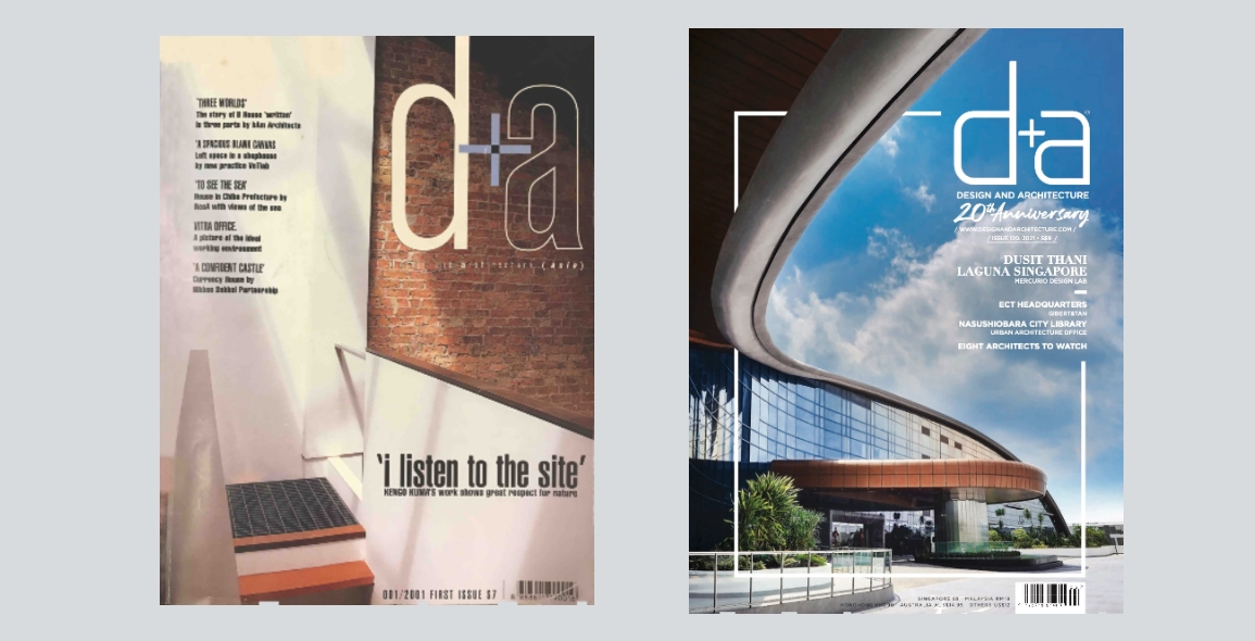
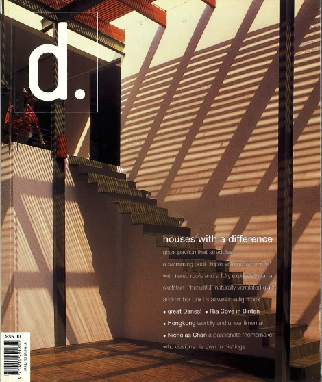
Subsequently, there emerged new local publications like Form and d., the precursor of d+a that itself made its debut in 2001.
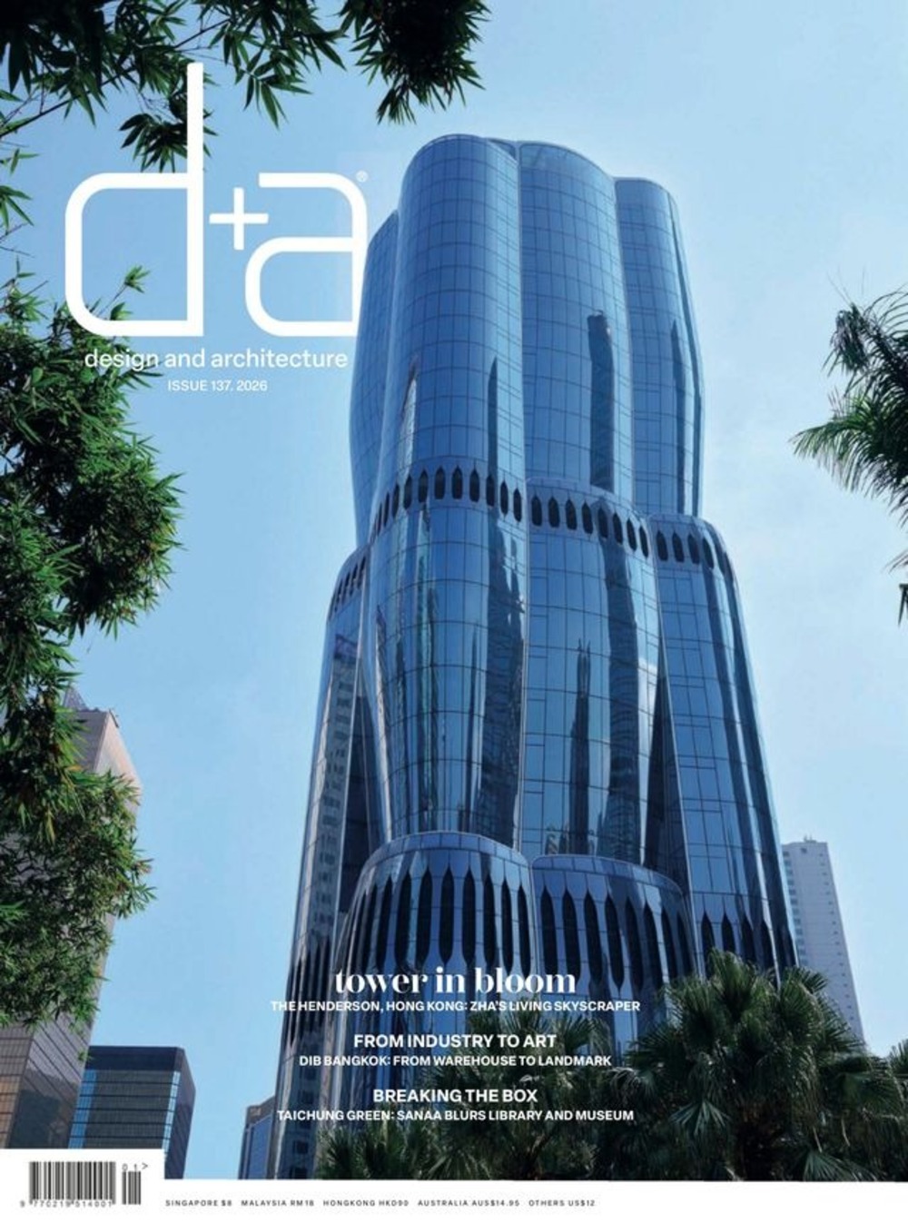
For a publication like d+a to celebrate its 20th anniversary is a truly amazing feat in the world of publishing.
It is indeed one of the few magazines to have successfully navigated the financial turmoil of the new ecosystem.
Like many other design magazines, d+a tries to cover a wide array of topics in the creative economies.
Its editorial stance has always been all-embracing, but with an eye towards promoting emerging Singaporean design talents by showcasing their works.
This is highly important in providing a platform for future movers and shakers of the design world to have their projects made visible to a wider audience.
At the same time, the emergence of a group of architectural photographers is also partly due to the specialised needs required by the publication.
Staying ahead
Good magazines are compelling visual journalism.
One of things that struck me all these years is how consistent the brand’s visual identity has been.
It is an inspiring example of constant rejuvenation, while keeping its identity as an authoritative design voice.

Through the two decades, the magazine has been superbly helmed by the strong editorial voice of ex-editor Thio Lay Hoon and her team.
This distinctive creative baton was subsequently passed on to current editor Low Shi Ping.
The sense of dynamism in the written and graphic energy continues to elevate the magazine above its competitors in a saturated industry.
The current editorial team has a clear appreciation for important issues like sustainability balanced with design flair, without veering into an obvious preference for works endorsing a single pervasive design style.
A high standard of editorial – which is really all about curating thoughts on specific design issues – cannot be overemphasised.
The magazine industry will remain very much precariously alive.
In order to differentiate themselves, these print products will inevitably be of a lower frequency but higher quality product.
At the same time they will have to embrace branding principles to ensure that they continue to nimbly engage their readership in a relevant and refreshing way.
As long as they understand their roles in the lives of those who consume them, magazines will continue to survive, and thrive, even.
Tan Hock Beng is the Principal of MAPS, a global design practice based in Singapore and Bangkok. He writes extensively for various design publications and is the author of nine books on architecture and design.


 Share
Share
