Encountering NOM while walking down Erskine Road from Kadayanallur St feels like being given a shot of serotonin.
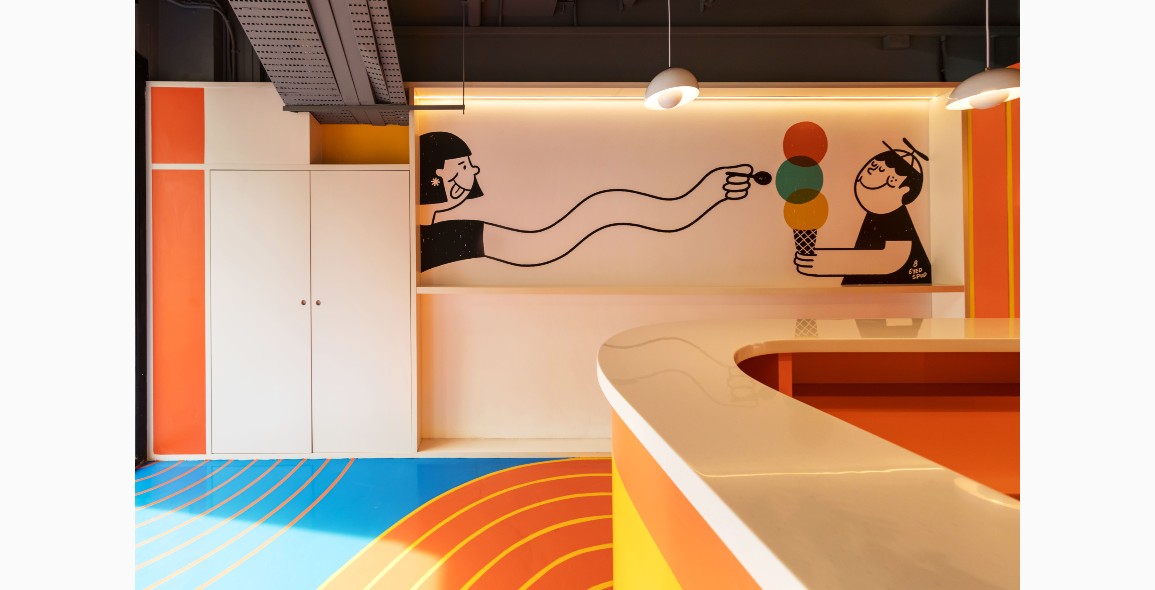
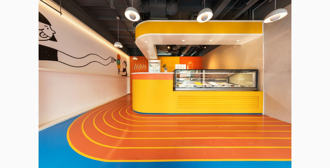
Wedged in between neighbours that are dark, utilitarian and clearly not design-centric, the gelateria is, in stark contrast, bright, colourful and just plain happy.
Multidisciplinary studio WY-TO is responsible for the design concept, supported by NOM’s owner Nicholas Ting.
“In contrast to the mature street outside, the shophouse’s doors open up to an unexpected, lively paradise that will bring out the five-year-old in you,” describes WY-TO.
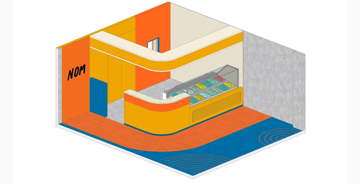
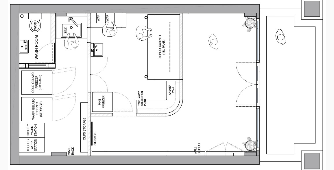
Although merely 38m2, it has managed to cleverly pack everything from a tempting gelato display, to two work and storage areas in the middle and rear, and a generously sized customer queuing and circulation zone up front.


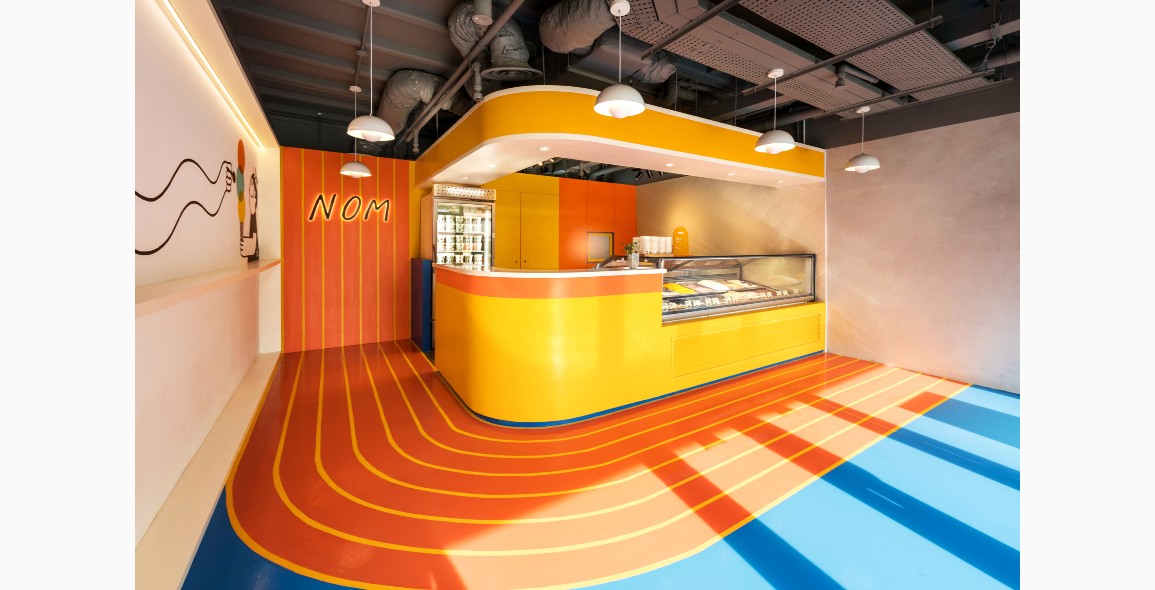
All this is dressed up in the bold, contrasting colours of yellow, orange and blue, complemented by quirky illustrations by creative studio 8EyedSpud, which was also responsible for NOM’s visual identity.
Another standout element: The use of curves that visually expands the space and offers it a fluidity “like a gelato melting in summer”, adds WY-TO.
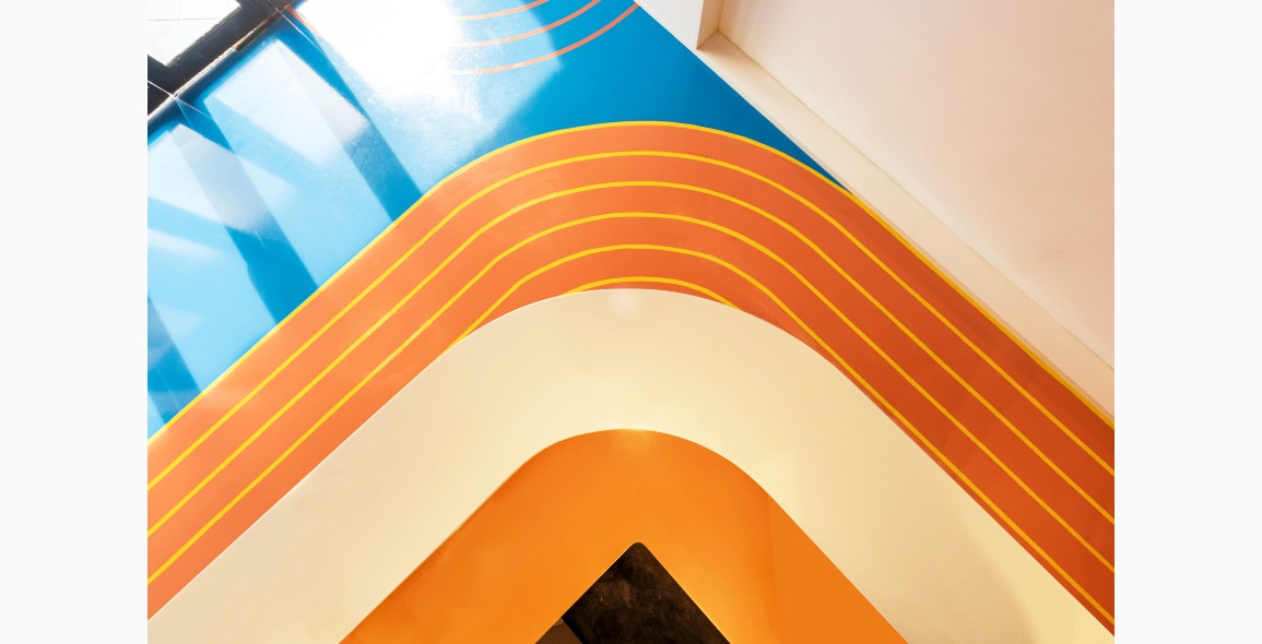
The most striking is the series on the ground hugging the gelato display and counter, done in epoxy, that extends to the rear and up a feature wall with NOM’s logo.
Its parallel evenness brings to mind an athletic trek and to Ting, is symbolic of the idea of fun and people running around.
Says WY-TO, “Its vivid continuity suggests a race to the fantasy of flavours, attracting curious passers-by to peek at operating hours of the day.”
One corner of the counter too is curved and suspended above it is a design element that also doubles up as storage space.


Functionality is not overlooked amid all the fun – the wall perpendicular to the gelato display in the service section is white-tiled and arranged in a waffle-inspired pattern for easy cleaning.
A translucent cut-out in the back wall is actually a sliding window that allows quick access to a sink in the rear without having to walk over.
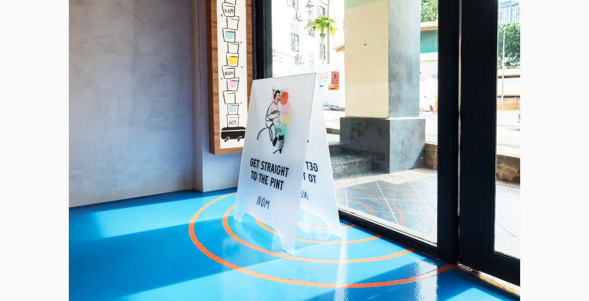
In the front, a wall is covered in fair-faced concrete and at the moment, a blank canvas that stands ready to host shelves filled with merchandise or anything else that Ting dreams up.
He is glad with the way the gelateria has turned out, representing a place where people can let their hair down and enjoy his unique flavours, such as Blue Cheese With Walnut Praline and Bronte Pistachio.
“By optimising the pint-sized layout and sprinkling design purposefully, NOM invites you to be immersed in a boy’s dream of scooping up quality gelato,” says WY-TO.
The best part? You’ll walk away not just with a cup, cone or even pint in hand, but feeling incredibly happy too.


 Share
Share
