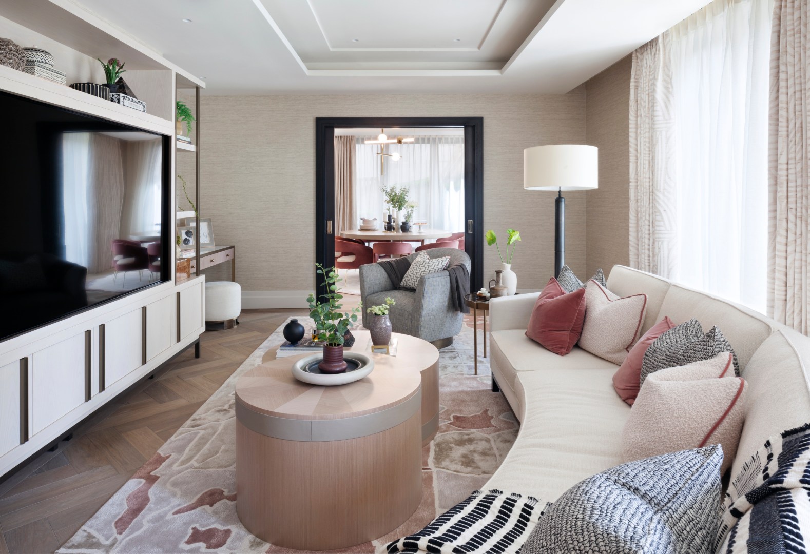
Award-winning studio Elicyon has designed Blossom Apartment in London’s Chelsea Barracks, itself a project that gentrifies the historical British Army barracks in the City of Westminster.
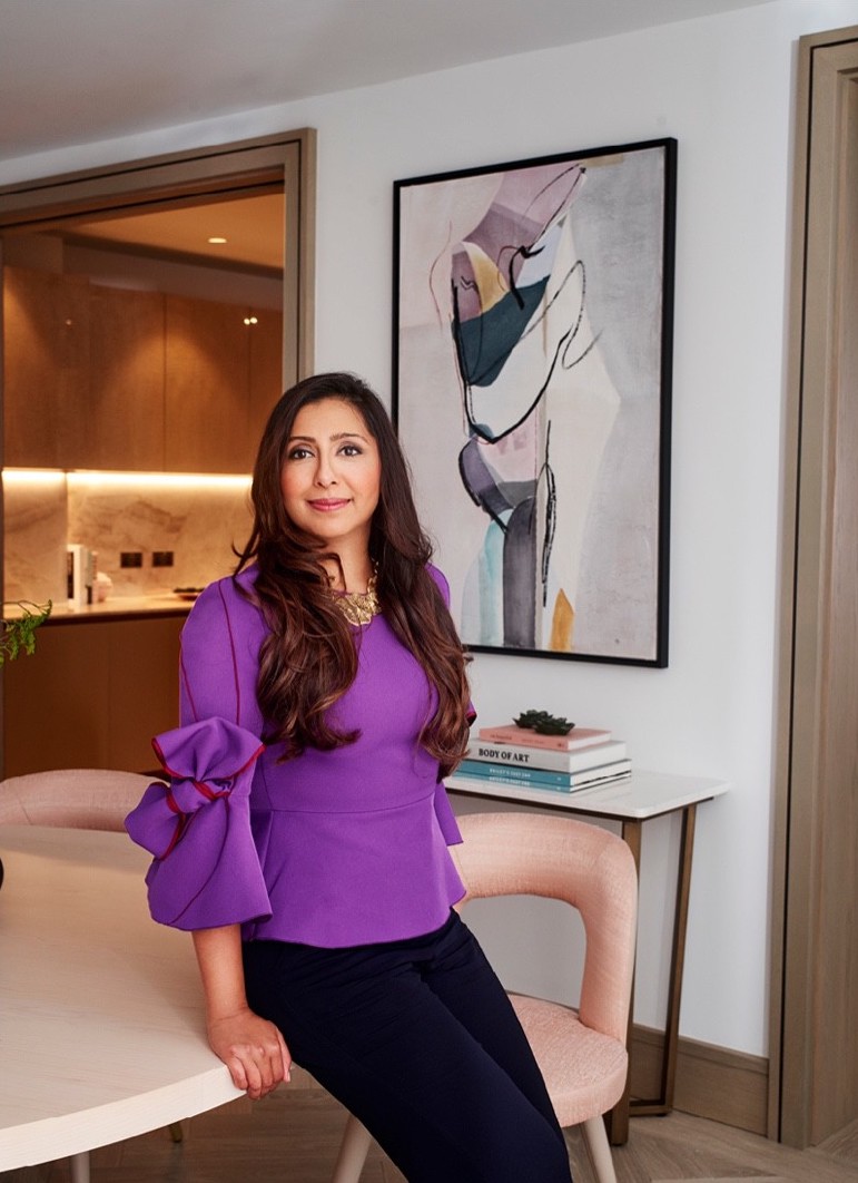
Its proximity to Belgravia spurred Elicyon’s Founder and Director Charu Gandhi to take design cues from the exclusive neighbourhood, including its private parks, and the annual Chelsea Flower Show held a stone’s throw away from the development.
The three-bedroom duplex apartment is replete with floral motifs and materiality – referencing the location’s intimate relationship with nature.
“This is expressed in the ceramic textures on some of the table lamps,” points out Gandhi.
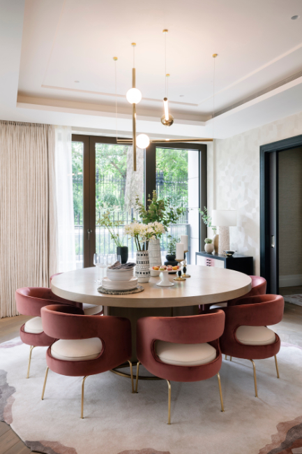
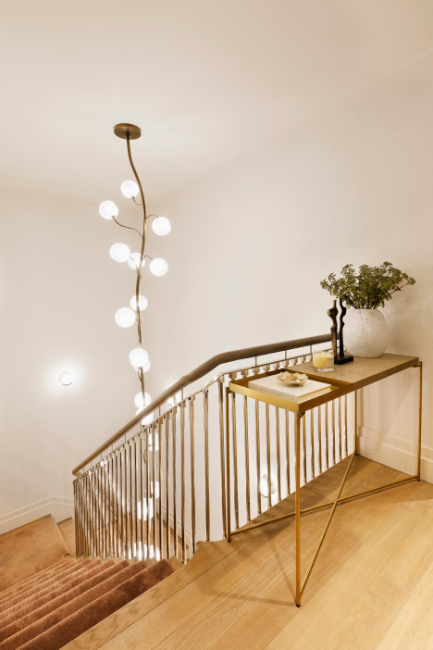
“The rug in the dining room is reminiscent of a flower unfurling and the chandelier that sinews down into the staircase is a bespoke design of seed pods imagined as frosted light fittings on a brushed brass ‘stalk’.”


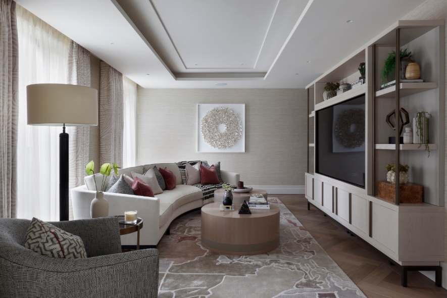
Another unifying theme: the use of neutral, soft-muted pastels and earth-tone colours.
This was intentionally done to create an atmosphere that is both calm and playful, accented by “glamorous elements”.
“I particularly like how the dining chairs draw your eye across the lateral living space, into the dining room beyond, with their deeper colour tone, interesting form and metal legs,” she says.
Other tricks she employed to keep the feel light and uncluttered include setting joinery pieces in from the edges of the room to look less fitted and more freestanding.
“[It is] like pieces of furniture, so you always read the extent of the room,” she explains.
At the same time, Gandhi was careful to give each floor a distinctive characteristic too, “A home across one level is quite different to that across dual or multiple levels.
“There is a different flow between the spaces and that metaphorical separation between the public and private spaces of the residence is more enhanced with a duplex apartment.”
With the lower floor set below ground level, but with relatively high ceilings, it was especially imperative to keep the design soft and light.
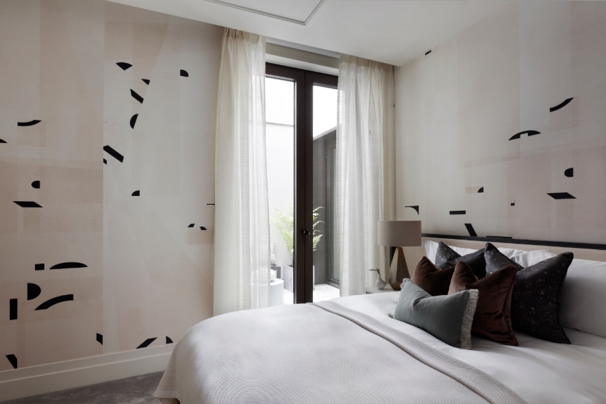
The floor is fitted with a grey carpet and the bedroom has a wallpaper with a fragmented graphic.
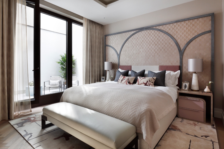
In contrast, the upper level is paved with timber on the floor for a different tone and materiality, and the wallpaper used has more solid and structured forms.
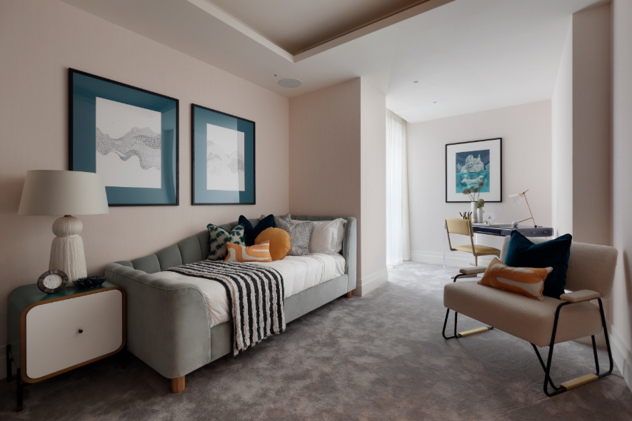
Planned as a family home, Blossom Apartment accommodates four comfortably, with a third room that can be converted into a home office courtesy of a large picture window.
This is especially pertinent given the need to work from home due to COVID-19.


With its soothing design and subtle references to nature, this duplex will undoubtedly find itself owners that will delight in living there.
On A Side Note: Designing For WFH
In conceptualising Blossom Apartment to be flexible enough to live and work out of, Gandhi has the following tips on how to integrate a home office to share with fellow interior designers and homeowners.
For Interior Designers
The most important factor is the specific brief, to make the space as tailored to requirements. Some of our clients need extensive technology support for working from home, ranging from multiple TV screens to track markets and video conferencing facilities, while others want a place to retreat and do their deep-thinking work.
In smaller spaces, we like to set up the desk with a view, so that you are looking out of the space and your eye can travel. A design trend that we have been championing recently is to add depth and interest to the study space, which can tend to look flat if its overtly functional. Taking inspiration from a library or gallery setting, we use interesting textures to the back of units such as parchment or eglomise mirror and beautiful veneers with varying tones and lacquer finishes.
If there is a window in the study, then curtains or blinds can frame the room beautifully and I particularly like using heavy wool fabrics for curtains that fall well, with an interesting edge detail. The window dressings mean you can control the day light coming into the room, particularly if the study is south facing, so that bright sunshine doesn’t affect your screen or reading.
Adding interest extends to the study having personality rather than being a bland space, so we work with our clients to add objects of relevance such as family photos, meaningful objet and often pieces they have collected from the around the world on their travels.
For Homeowners
DESK POSITION: In larger rooms, it can work better to set the desk at the back of the room, with the shelving unit behind the desk for easy access to papers and looking out across the length of the room. We love creating a spill-over space within the study if space allows, so a chaise lounge or small seating arrangement where our client can read or rest, turning into a sanctuary away from the world rather than a purely functional space.
LIGHTING: Good lighting is key to design different mood settings. Mixing ceiling lighting with desk, floor and table lamps is important for creating an atmosphere. Lighting shelves and artwork also adds depth to the room and can create a focal point either to compliment, or in absence of a view.
AVOID CLUTTER: In smaller rooms in particular, artwork or a sculpture or bust located on a plinth or within the line of sight can draw the eye away from the desk and screen. I think that study spaces that are clutter-free create a calm space to work in, so designing appropriate storage, where paperwork, files or IT equipment such as printers can be tucked away is functionally important.
We work hard to hide away all the cables associated with IT in particular, so cable management in our usually bespoke desks is well considered with pop up sockets or cables disappearing into the leg(s) of the table. Incorporating technology is a key trend that has evolved over time.
If we are using antique desks, then we create a cable channel running on the side of the desk that discretely tucks away wires. I find more and more clients want to use a desk that has some history associated with their family or their own work life, which is wonderful to celebrate. A handy tip is to create a pull-out shelf for printers, nothing as annoying as craning your neck into a cupboard while trying to scan a document
FRAME WINDOWS: If there is a window in the study, then curtains or blinds can frame the room beautifully and I particularly like using heavy wool fabrics for curtains that fall well, with an interesting edge detail.
Enjoyed reading about this project? Read our latest issue 117 (August-October 2020), which focuses on residences from Singapore, Malaysia, China and Europe.


 Share
Share
